POWER UP YOUR HOVERBLADES!
Boost through levels under constant bombardment, avoid dangerous hazards, and make split second decisions for a new personal best or total wipeout.
✅ Momentum-driven platforming
✅ Dynamic soundtrack
✅ Solo or local multiplayer chaos
NEW GAME IN DEVELOPMENT
Check out Melonhead Games for more info. We can't wait to show you what's cooking!
STAY IN TOUCH
Join our mailing list for game updates, event notifications, behind the scenes content and all-important pet pics!
THANK YOU!
You're now signed up for updates, we can't wait to have you along for the journey!
DEV BLOG ARCHIVE
Look behind the scenes at the early development of Rooftop Renegade and how it came to life.Each blog contains valuable retrospectives, developer tips and early concepts that go into making and releasing a game for pc & consoles.
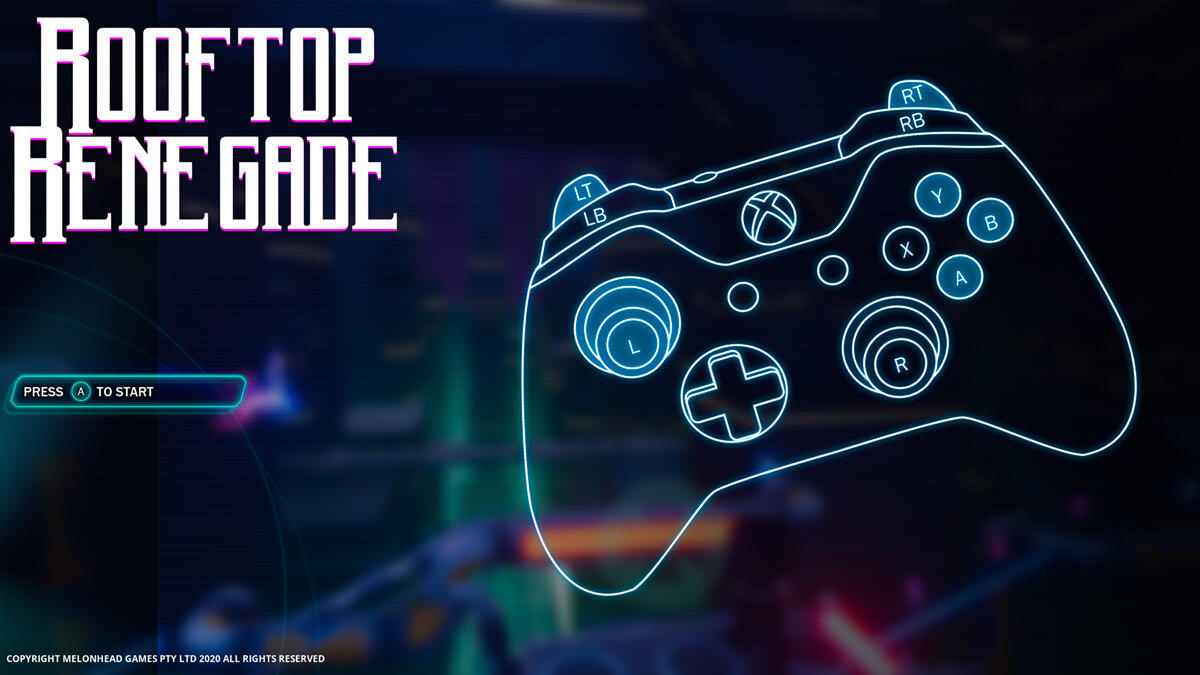
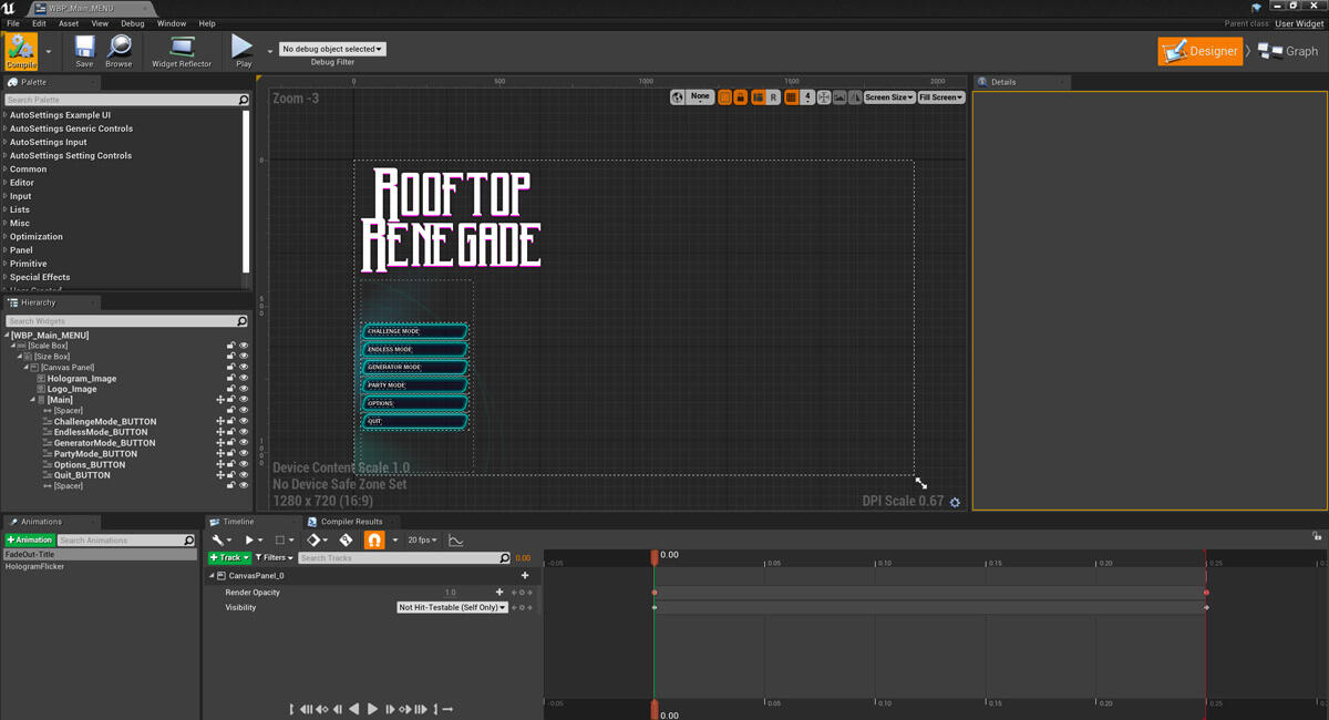
DESIGNING THE MENU Alex Ferrabetta 25 Nov 2020
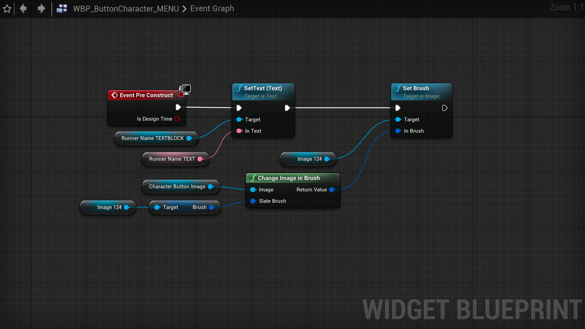
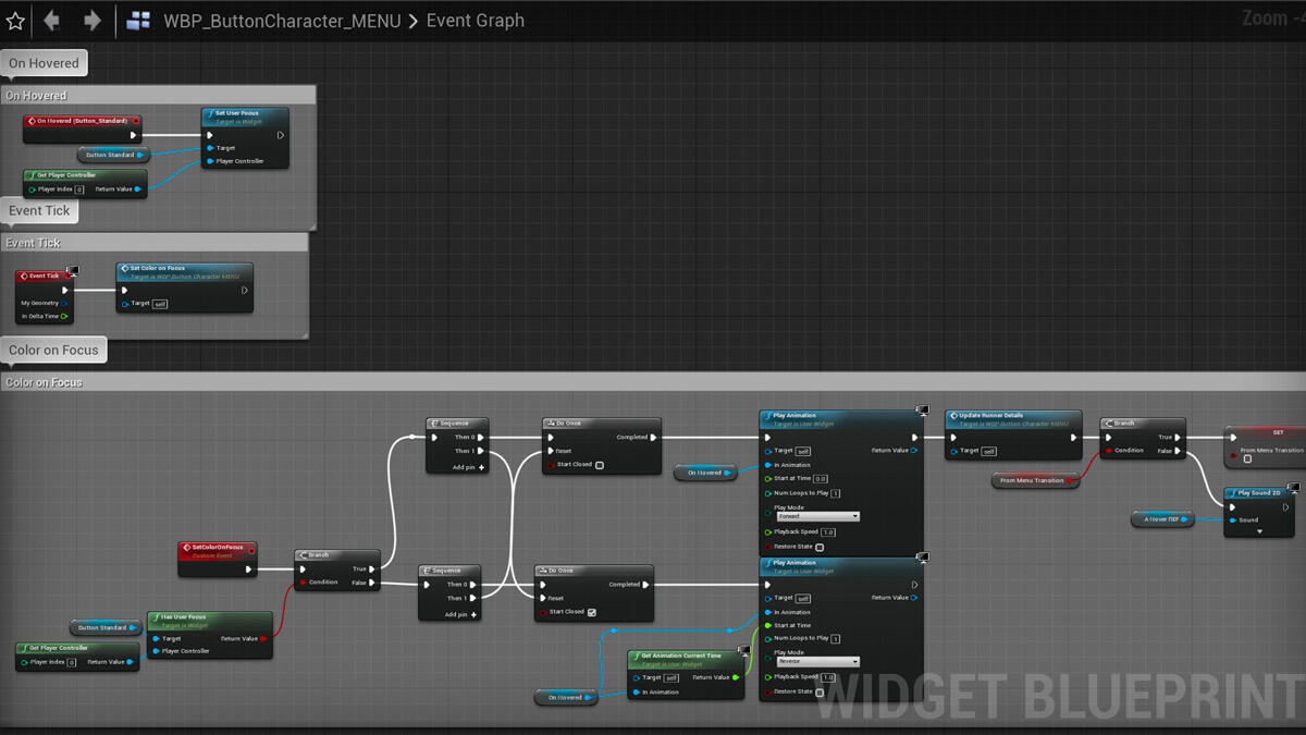
UMG & GAMEPAD NAVIGATION George Martin 27 May 2020
BALANCING OVERLAP Patrick Webb 15 April 2020
RISING RESORT ART Alex Ferrabetta 15 March 2020
BUG BUSTING George Martin 23 Sept 2019
DESIGNING A SOLDIER Sam Frost 12 August 2019
DESIGNING LEADERBOARDS Alex Ferrabetta 29 July 2019
ARTIST TO PROGRAMMER George Martin 15 July 2019
DESIGNING POWERS Patrick Webb 01 July 2019
SVET CHARACTER UPDATE Sam Frost 27 May 2019
CYBER CITY ART Alex Ferrabetta 20 May 2019
ENEMY AI George Martin 13 May 2019
PUBLIC PLAYTEST AT GREENLIGHT Patrick Webb 6 May 2019
ROOFTOP RENEGADE ORIGIN STORY RR Dev Team 21 Feb 2019
BALANCING OVERLAP
Patrick Webb - Wednesday 15 April 2020
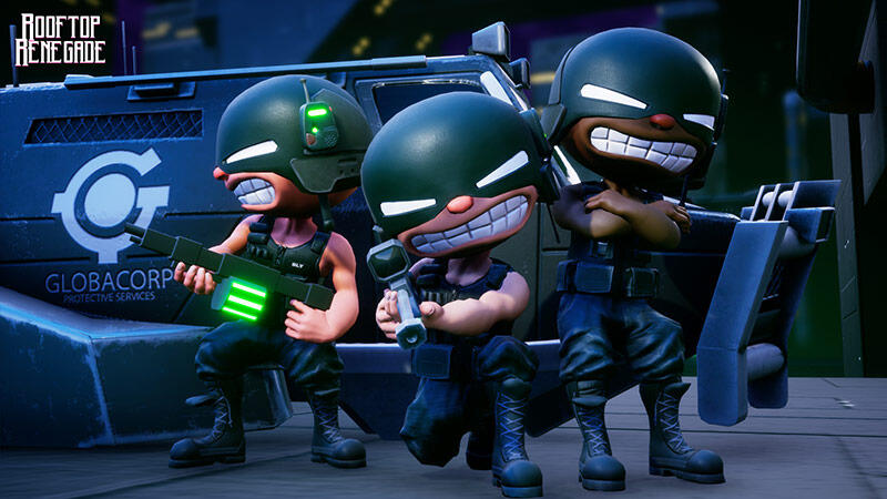
Globacorp could learn a bit about teamwork...
Over the years we’ve developed a workflow designed around reducing wasted content and increasing collaboration between the team. While we all have our responsibilities, our workload isn’t sliced up like a pizza, and we’re always trying to leverage each other’s strengths. Because of this we’re able to build our game dynamically in engine, while only requiring our programmer to know how to read the matrix.
DYNAMIC ROLES
Our workflow is all about making functions scalable and accessible between the team. Using tech art principles of designing tools for the team, we’ve trained to use the tools Unreal has built in to work without the limitations of being purely trained as an artist, designer or a programmer. Taking extra time to set up master materials, exposing parameters that could be useful, and keeping functions organised all vastly help the team and stop those “hey can I just grab you for a minute” moments that are never just moments. These also break down the walls between roles and allow for different ways of thinking.
FAST FEATURES
I’ve recently implemented a powerup system that had been on the design backburner for a while, a quick prototype that covered everything that needs to be there to experiment with and decide if it should be pursued. I started by identifying what I would need access to. For this test it was character speed and temporal recharge meter. From working on the character early on I knew where these functions were held. Simple enough. Next, a trigger. Already in the game we have shards that when collected, trigger the character to increase the temporal meter. Awesome, now I have the functions I need to mess with, and a blueprint that can already speak to them. From there I can add a simple function, tweak the colours on the shard blueprint, and place it in a few procedural level chunks for testing.
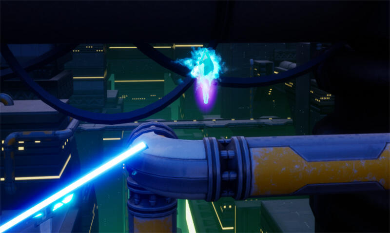
Shiny new pickups to aim for!
Voila, we now have stat boosting powerups in Rooftop Renegade. Time is extremely valuable for the team, between taking on contract work and working other jobs, we need to be as efficient as possible to make this game the best it can be. This philosophy of designing for additions is an integral part of how we maintain a consistent stream of additions and sidestep the pitfall of spending a ton of time on a cut feature.
BRING THE HAZARDS
Another example is the hazards. George has created a parent blueprint for the core functions of the hazards, allowing me to create new ones that inherit all of the traits of the core, such as the functionality that causes the gunners to fire at them, and the likelihood of that occurring. This means I can use my own blueprint knowledge to create whatever effects I require, without having to link them up to backend systems that I haven’t set up, allowing for much faster prototype turnaround. Once these are complete and I’m satisfied with the game feel, Alex can create art assets that fit the hazards dimensions, and after a quick performance profile, they’re ready to go.
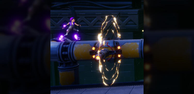
From prototype to product in almost a day.
KEEPING CONTROL
All of this is handled through our source control of choice, Perforce. While a lot of good options are out there, using binary files can add conflict and Perforce allows us to keep our communication focussed while we jump between files. Working remotely has added an extra layer of complexity to collaboration, but with the right tools and regular video calls, we’ve kept our workflow going.
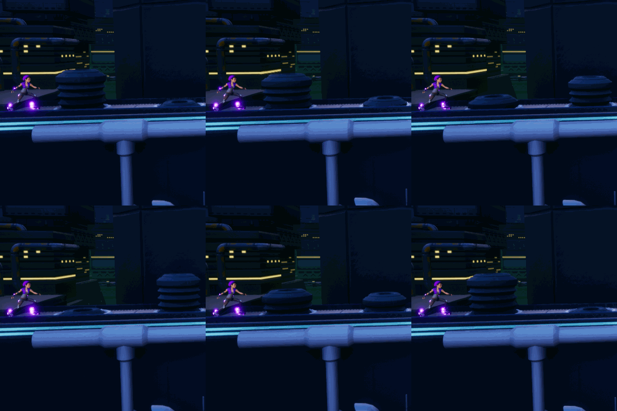
Game changer or failed prototype, only time will tell!
KEEP IN MIND
Having a workflow that allows everyone the tools to focus on their strengths produces great results and I hope this can get you thinking about your team the next time you’re rushing to push a revision without that extra little clean-up. I’m sure we’ll talk more in the future about how we’ve used this shared knowledge to approach problems from a new perspective.That’s all from now, back to building levels and overpowering characters!Patrick
Rising Resort: Environment Art at 30,000 ft.
Alex Ferrabetta - Monday 15 March 2020
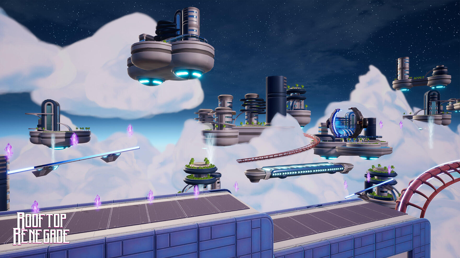
After the dark dystopian feel of Cyber City it's time for a brighter palate and curved edges!
Hello, my fellow Renegades and welcome to another Environment Art blog! Last time, we covered the first world in Rooftop Renegade, Cyber City; A dystopian, overcrowded metropolis, home to the evil corporation, Globacorp. Today, I’ll be running you through our second world, the holiday destination in the sky; Rising Resort.
The idea
The residents of Cyber City have seen enough industrial buildings for a lifetime and the natural world has been displaced to make way for humankind. For peace and tranquillity there’s nowhere for the rich to go but up. Rising Resort replicates natural world with the same materials that created Cyber City, but for the purpose of indulgence rather than affordability. If the rich can’t have beaches, they’ll build their own beaches. If the cities are too crowded, they’ll build their own city; high above the madness that is Cyber City.
The concept
Originally, Rising Resort started out as another level at the beginning of Rooftop Renegade’s development, Cloudy Carnival. We thought it would be fun to create an amusement park level, with the Rooftops of Cyber City being replaced by a decommissioned roller coaster with scaffolding. After hitting a few walls with design consistency, the idea was eventually reworked into a paradise, high above the clouds with a roller coaster system weaving between the buildings.Rising Resort was designed with a few ideas in mind: mimic the surroundings of the upper atmosphere, create an organic/mechanic beach resort and show off the wealth and luxury of Cyber City’s upper class. The giant floating platforms and their buildings’ silhouettes replicate the giant clouds they’re surrounded by. The floating platforms themselves are like flying tropical islands in both shape and colour, with the infinite sky posing as the paradise’s ocean. I also wanted to convey that this paradise is fake; it disguises itself as organic and non-intrusive but it’s still flying pieces of metal and glass covered in superficial plant life.
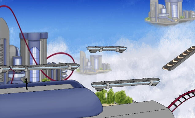
There was a clear vision of the world from concept to completion.
Shape language
For this world, I wanted to break away from the shape language that made Cyber City so cold and intimidating. Rising Resort is a holiday destination for the elite class of Cyber City, a retreat from the dense hard buildings and toxic green smog.In Rising Resort, there are very little 90-degree angles. Everything has been rounded off, from the building tops, to the floating islands that dot the sky. Even the roller coaster tracks that Svetlana grinds along are large and round with no right angles. Giant glass panes cover the islands resembling waterfalls, broken up by actual waterfalls descending below like rain from the heavens.
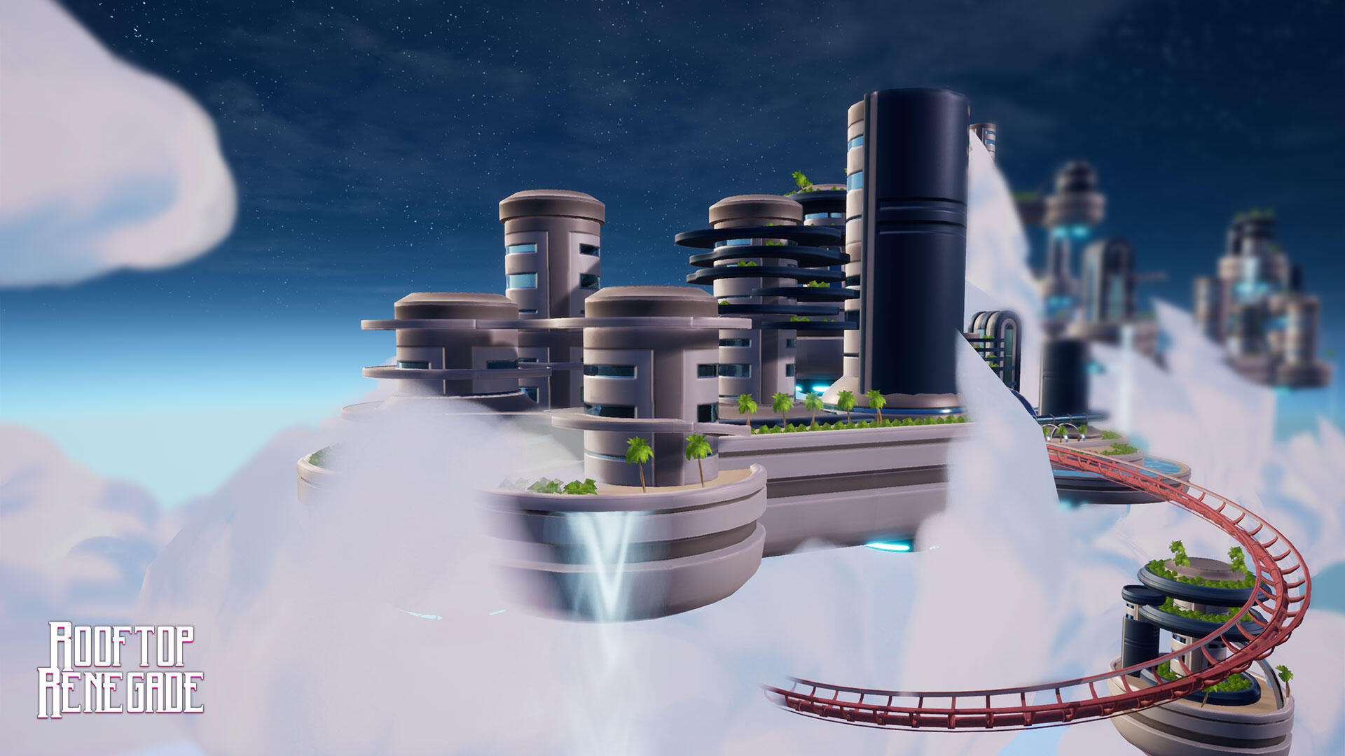
In Rising Resort, there are very few hard angles in the architecture. This is to evoke feelings of a safe haven along with the natural curves of clouds.
The Palate
When you think of a tropical paradise, warm images come to mind: sunsets, sand, wood and trees. Although Rising Resort is a paradise, I wanted to convey that this paradise is man-made and lacks that natural warmth. For this, I chose a cool palate of blues and greys for the sky along with the buildings and platforms. Blue sci-fi lighting is also apparent on the various platforms that populate the foreground.

In Rising Resort, there are very few hard angles in the architecture. This is to evoke feelings of a safe haven along with the natural curves of clouds.
Environment art and gameplay
If the next world is an underground cave or a space station in a crater, the game play needs to remain consistent with the other worlds. Svet skates across high platforms whilst avoiding a variety of hazards. If that core criteria are met, then we can explore any kind of environment.We work with the idea that the environment is there to provide narrative and support the gameplay, and the gameplay should not be restricted by the environment design. If we come up with an idea that looks great but ultimately doesn’t add to, or takes away, from the gameplay experience it is either shelved or reworked into something new.As always, thank you for reading and please feel free to reach out to me via twitter if you have any questions or comments about game art!
Bug Busting: The Case Of The Disappearing Svet
George Martin - Monday 23 September 2019
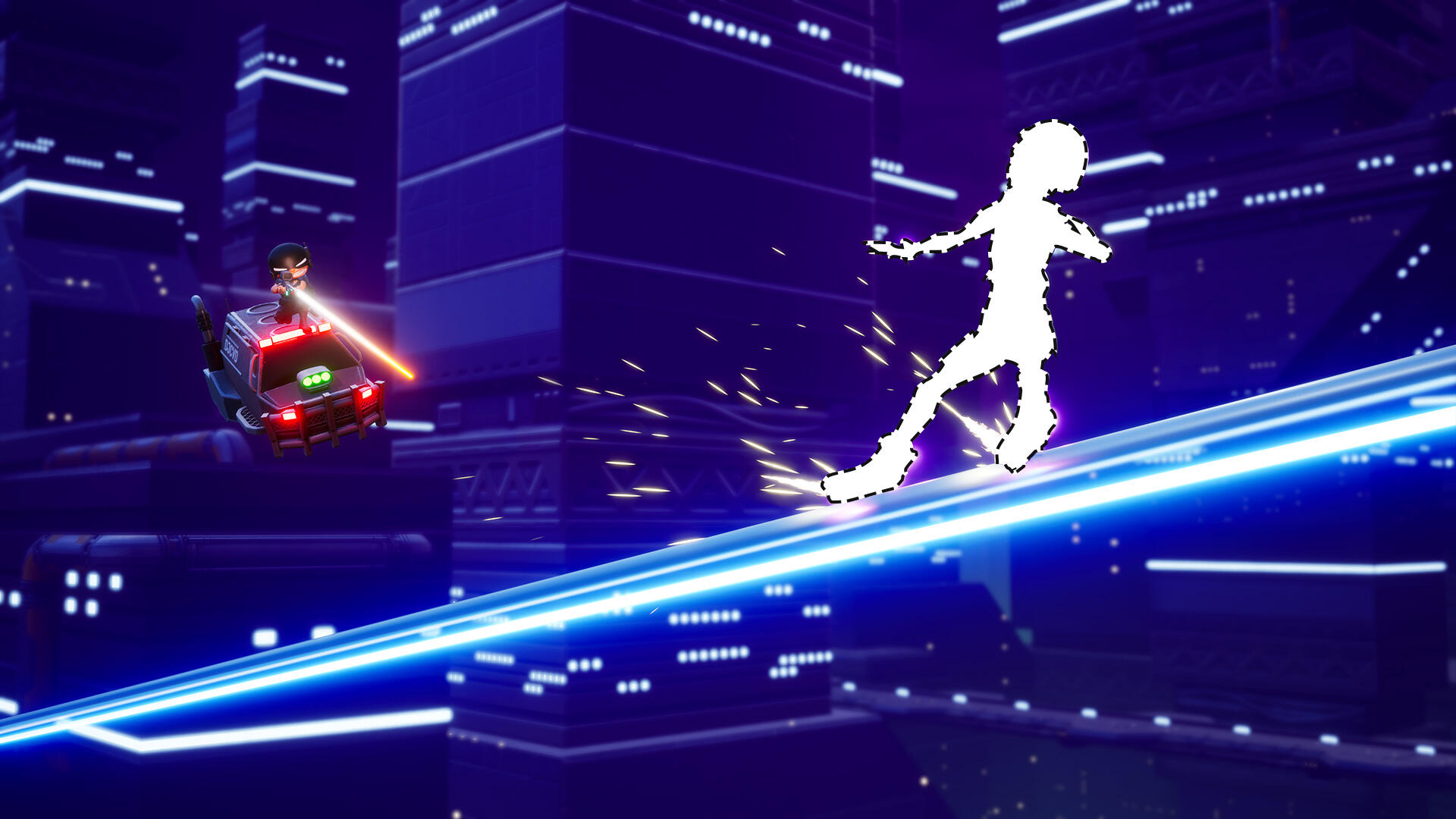
I feel like something is missing from this image...
Testing for and identifying bugs is something I do on a regular basis, but not all bugs are created equal. There are those that for the most part go unnoticed, yet more that end up becoming features, and then there are those that completely break the game. One such game breaking bug appeared in the game prior to AVCon 2019.
Testing 1, 2, 3!
Between each event that we show off the game we work hard to introduce new features and improve existing ones based on your feedback. These changes can sometimes introduce new bugs alongside them so leading up to an event like AVCon we playtest a lot.In this playtesting we discovered a bug that had appeared in multiplayer causing the character to, apparently at random, not respawn correctly at the start of round 2 onwards. The only parts of the character that were visible were the trails from her boots and on top of that, her movement was completely broken. This was certainly a bug and not a feature!
A Missing Heroine
Having not edited the player reset I was really confused as to what could be going wrong. I began attempting to isolate the problem, looking at each individual aspect of the tracker responsible for detecting the end of the round and resetting the character for the next rounds. I’d find something that could potentially be the cause, make changes and then test to see if it had fixed the bug. I’d then make note of the change in case it caused future bugs and keep going.
The Breakthrough
The seemingly random occurrences of this bug made testing difficult as it could sometimes take multiple runs of the game for it to happen again. At multiple times I thought I had fixed it, only for it to occur again a few runs later. This ended up going on for a few days and I was running out of time to have it fixed. Then I had a breakthrough.It wasn’t random!Now I knew that some factor must be changing between runs that the bug occurred and runs when it didn’t. Once I knew what changed I could isolate where the error was coming from and then I could fix it. Finally, I found the key; it was jumping. If the player jumped at the end of the round the bug didn’t occur. Suddenly the cause was obvious and I had been looking in the wrong place the whole time.
The True Culprit
It was the grind rails! I had recently overhauled our grind rail system to work differently to allow for some extra functionality in an upcoming map. The character would attach to the grind rails and follow the spline path used to create them. It turns out this new functionality was fighting with my reset function for positioning the character back to the start. After this realization I had it fixed in minutes, adding a command that would detach the character at the end of each round. One final session of testing and I could confirm that the bug had been solved.
The learning never stops
“...during the development process mistakes can and do happen, nobody is perfect.”
This was a learning experience for me in the importance of regression testing. Sometimes you don’t anticipate how that new feature you added will interact with other features you have coded. A good thing to remember and understand is that during the development process mistakes can and do happen, nobody is perfect. The important thing is to learn from these mistakes and always work towards improving your skills.Signing off,
George Martin
Boot camp to active service (designing and creating a soldier)
Sam Frost - Monday 12 August 2019
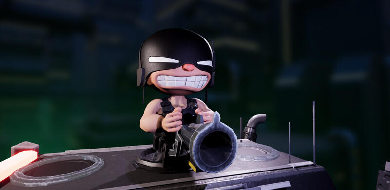
Grunt locked and loaded.
Back we go again, into the long long ago. I say long ago, it was the beginning of last year but a lot has changed since then. Much like the last blog I’m here to show a breakdown of the evolution of our cast of characters in Rooftop Renegade.
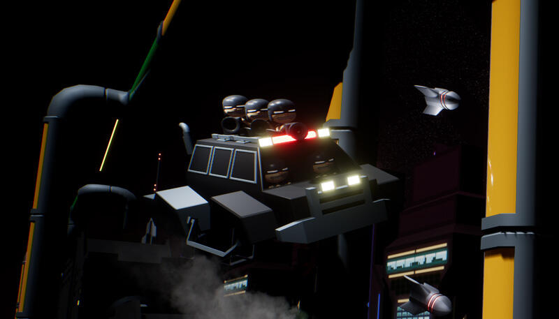
An action shot with the old gunners and van from not long after the game jam
This time the gunners take the stage
As with our protagonist, Svet, the gunners had humble beginnings. Their first iteration being the second thing on my priority list back at the game jam; there was a lot less time to work with.Alex had this idea floating around from when we were trying to come up with logos for our company, which was a silly looking head with an oversized army helmet. This became my basic art direction for the gunners.In the interest of rapid production during the game jam, the first gunners were basically just a head on a torso with arms and a massive helmet, I did give them a super quick face before moving on.
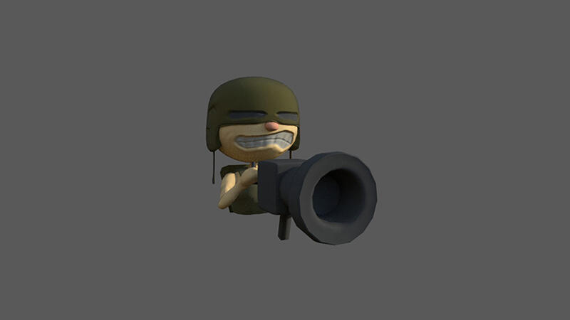
Aforementioned helmet arms and torso plus the little turret.
When we started full time production, I had the chance to overhaul the design; I had to answer some questions, mostly what their bodies would look like.
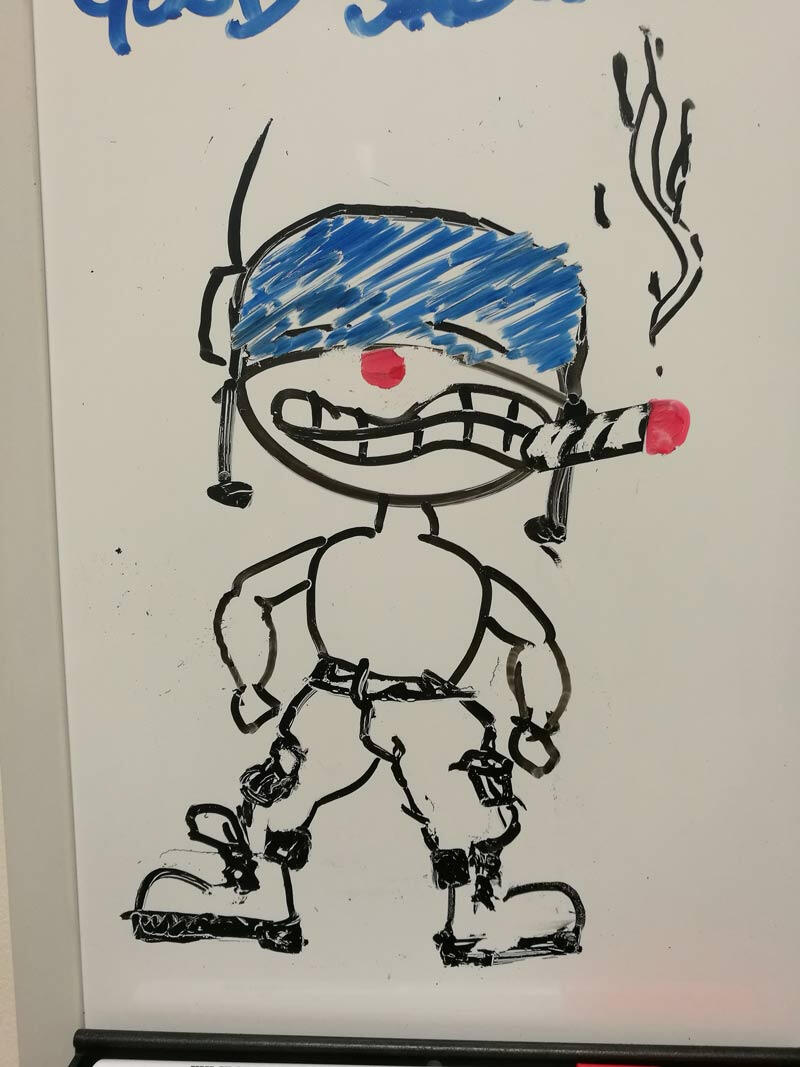
A very quick sketch on the whiteboard mostly as a joke ended up being pretty close to final result.
While at uni, I had worked on a large muscley orc character and just for a quick test I dropped his body in with the gunner head to see what it would look like.... ridiculous was the answer and not the intentional kind.
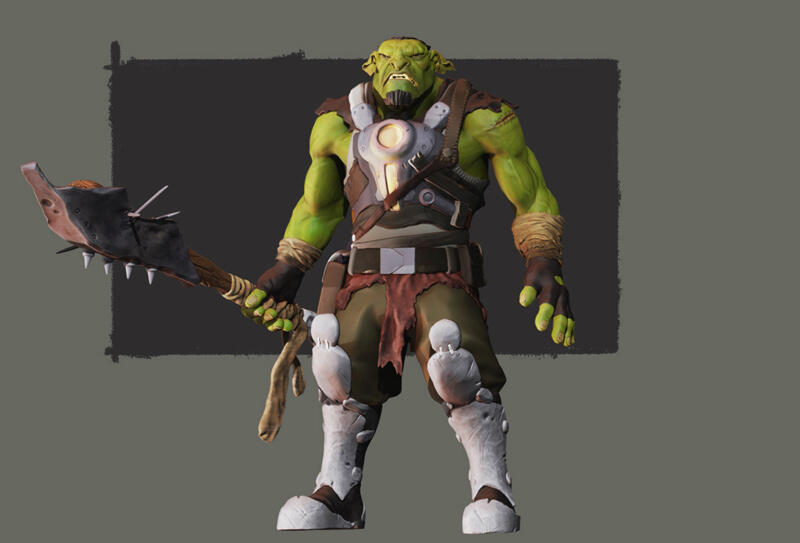
This was the orc character I made based on concepts from Tim McBurnie at CDW Studios.
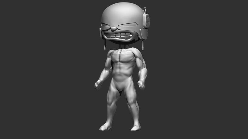
Here is the Gunner head attached to the orc body… a little much.
After getting some feedback from a few people, what I needed to do was push the stylisation and not just throw a hulked-out body on it just because I had one on hand. Amusing as it was, the fast ideation certainly helped with seeing what would and wouldn’t work.Thus, Grunt was born.
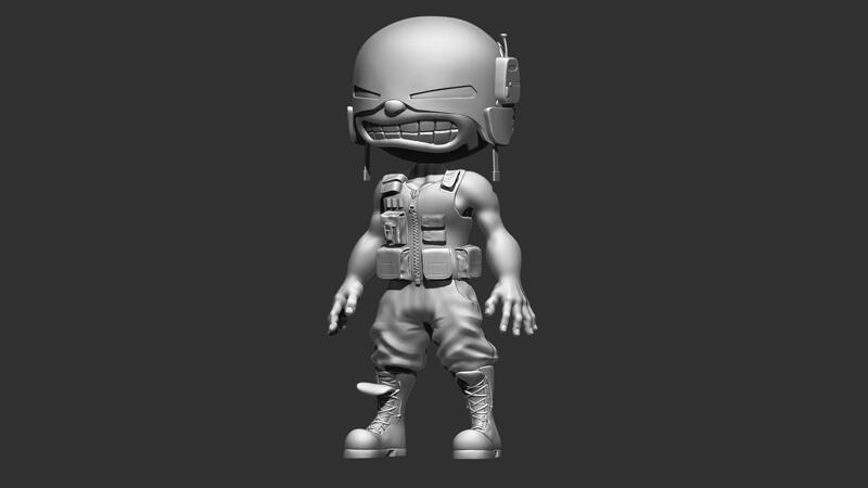
The finished sculpt.
Some of the things that I wanted to convey with these characters were the paramilitary aspects. Globacorp is a big evil corporation that has hired these goons to enforce their whims on the world of Rooftop Renegade; so, a lot of the designs we re based on special tactics police forces and military outfits and equipment. These decisions followed on with some of the other elements like their vehicle which is basically a flying SWAT van.Next up, some design decisions and discussions lead to the idea of multiple gunners.Back to the cheekily 3D rendered concept page for paint overs.
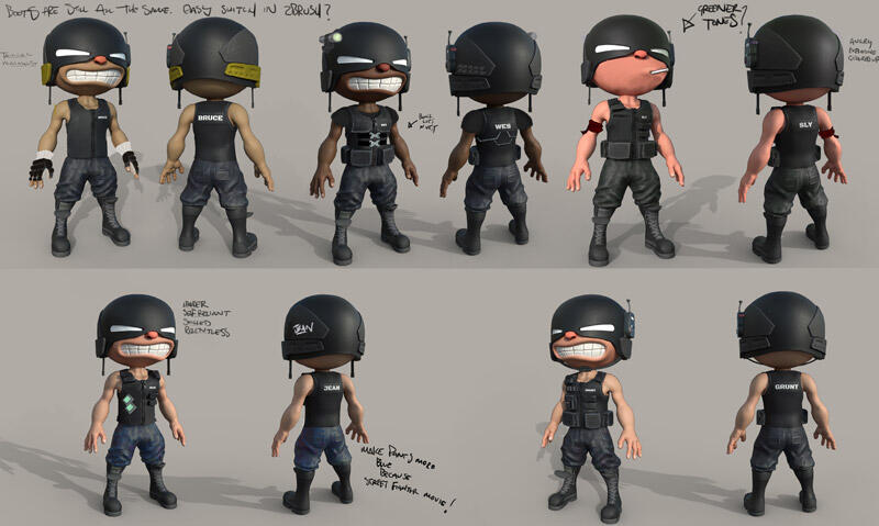
I rendered out some different skin tones to reflect their namesakes.
As a child of the 90's, I couldn't resist giving a little 90's action hero vibes from some of my favourite films.Meet Sly, Jean, and Wes.
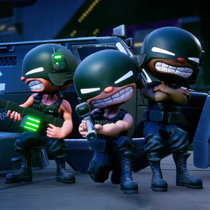
image caption Globacorp squad stay on point like Den en den den de den…
I’m pretty happy with the progression and overall design of the gunners; I still want to add a little more flair to them individually to finish them up, but that is on the polish list at this stage of development.Frosty
Leaderboards — player engagement ranks at number one
Alex Ferrabetta - Monday 29 July 2019
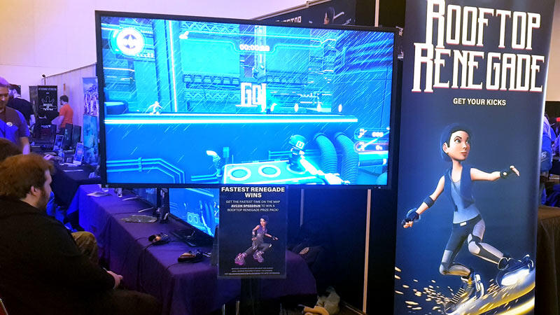
Executed correctly, a leaderboard can be an engaging way to help build a fan base.
It’s not enough to have the player win; the player needs to mark their territory. The player needs to warn off the other speed-running predators on the digital landscape. “This is my best record, attempting to beat this is an exercise in futility. Every time you knock me back, I’ll retake the mantle and assume ownership of the pride.” This is all done with a gamertag; a unique moniker to every gamer.
Speedrunning and Rooftop Renegade are a perfect combination. The game is fast paced, the protagonist, Svet, is propelled forwards by powerful hover blades known as ‘Chrono-Kicks’, and going too slow results in her untimely capture and thus, game over. A Rooftop Renegade leaderboard was first developed as an in-office competition, an excuse for the Melonheads to peacock their best times to the rest of the team — it seemed only natural to introduce friends to this as well.
AVCon 2018
When Rooftop Renegade was taken to its first public play event, AVCon 2018, the leaderboard followed suit. This time however, a dirty, in-office whiteboard plastered with concepts and inside jokes wasn’t going to cut it. This leaderboard had to be digital, it had to be pretty, but most importantly, it had to let those top 10 constantly changing speedrunners announce to everyone at the Adelaide Convention Centre that they were the fastest Renegades around…
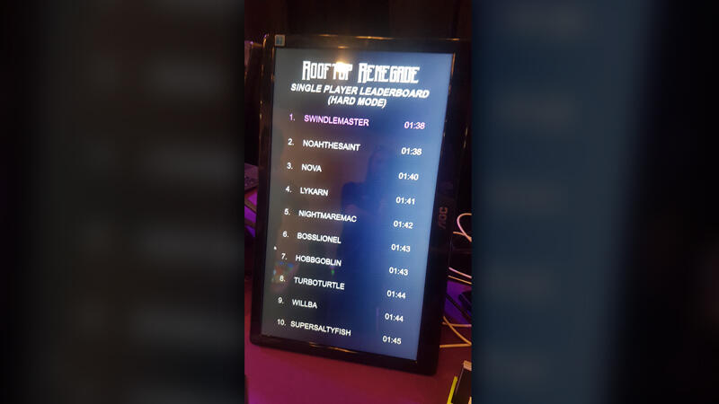
The AVCon 2018 leaderboard; pretty, but a functional nightmare!
The 2018 leaderboard was nothing more than a styled table written in HTML and CSS. It could display 10 gamertags at a time, their current record, look pretty… and that’s about it. The player’s gamertag and time still had to be entered in manually by one of the Melonheads who were also required to reorder the times on the fly. If a player beat their own record multiple times in a row, that melonhead had to keep going behind the table, find the correct tag, update it and reorder the rankings before a sharp-eyed speedrunner commented that 01:41 is faster than 01:43. It didn’t help that we hadn’t implemented milliseconds into our scoring yet, which led to a lot of runners pleading their 01:41 was faster than another runner’s 01:41. Oh, and this was all done through notepad with the team needing an introduction to HTML that morning.
AVCon 2019
“Alright, if we’re going to do this, the system needs to be flawless.”
When AVCon 2019 started approaching, there was talk of not including the leaderboard. It may make players too competitive, it may limit the amount of people can play the game, if it was anything like AVCon 2018, it was going to be too much of a hassle to keep track of. “Alright, if we’re going to do this, the system needs to be flawless” sighed Pat during one of our rare outings for fresh air. The new leaderboard would need to be accessible to anyone on the team, reorder the fastest times automatically, and include an optional email address to contact the speedrunners and let them know who held the best times by the weekend’s close.To make the leaderboard entry accessible to the rest of the team, I created a simple form with the fields ‘gamertag’, ‘time’ and ‘email’. Upon hitting submit, the player’s gamertag and time would display on a separate monitor. For this to work, HTML and CSS alone wasn’t going to cut it. We were going to need proper programming and a database.
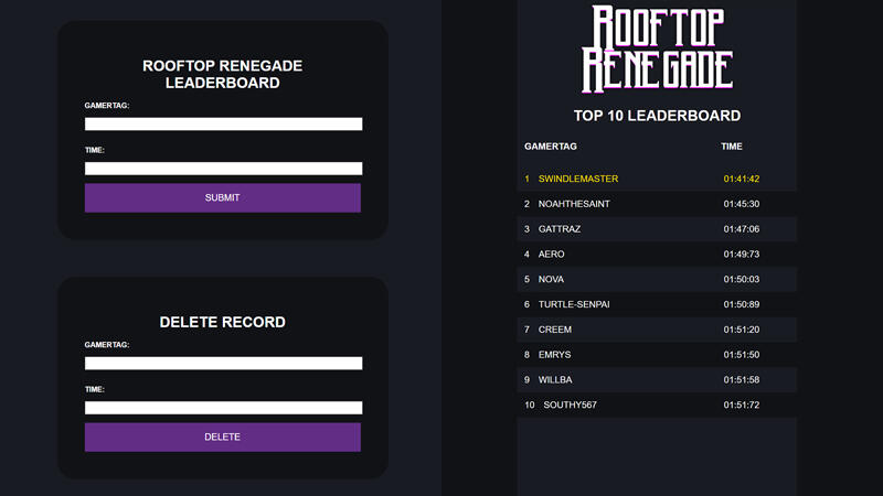
Left: A member of the team used the form to add or remove a runner’s time. Right: AVCon 2019’s Saturday leaderboard
By the Saturday morning of AVCon, the leaderboard was built and ready to be populated with the best times Adelaide gamers had to offer – albeit for one issue. While you could enter new times for new runners, replacing an existing runner’s time was going to be an issue.Every time you hit ‘submit’ on an online form, there is a lot of code tied to that button that copies the data entered, inserts it into a database and then, if necessary, displays that database. My limited knowledge of PHP, SQL and databases means I didn’t know the code to update existing data in a database (we’re all spoilt with Microsoft excel!) Enter the white knight, Kerri, Patrick’s partner and Melonhead Games’ Morale Officer, who with her extensive knowledge of databases was able to fix my work and allow the team to update player times when necessary.By the end of Sunday, the leaderboard had proved a success! The speedrunning setup at our booth was constantly populated with Renegades trying to top the mantle, whilst others watched their position on the leaderboard go up and down. By the end of the weekend we had secured over 50 unique runner times. Not only did this feel great to have so many people interested in Rooftop Renegade, it was also a great source of feedback on how fast players can complete our hardest levels.Whilst the design of our AVCon 2019 leaderboard was a step in the right direction, there’s still more work needed for the perfect system. The best systems are ones running in the background that the player is not aware of. Before our next public speedrun, we need to brainstorm ways to make this process as easy for the players (and the Melonheads) as possible.Alex Ferrabetta
A Journey from Artist to Programmer
George Martin - Monday 15 July 2019
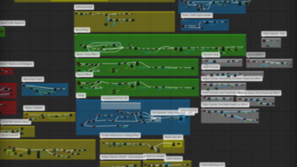
Unreal Engine's blueprint scripting helps artists code their games.
Today I thought I'd share the tale about how I found myself in the role of programmer for Melonhead Games. It wasn't a straightforward journey, I actually bounced around quite a bit before finding myself where I am.
It started in high school when I first started learning 3D modeling, I enjoyed the class a lot but in later years dropped it to focus on maths so I could get into mechatronic engineering. Upon arriving at university, I quickly realised this degree wasn't for me, but the one topic I liked the most involved 3D modeling.At this point, a few years had passed since I had last done any 3D modeling but I found I still had a passion for it. I made a decision to stop my Bachelor of Mechatronic Engineering and went to study an Advanced Diploma of Screen and Media specializing in game art.
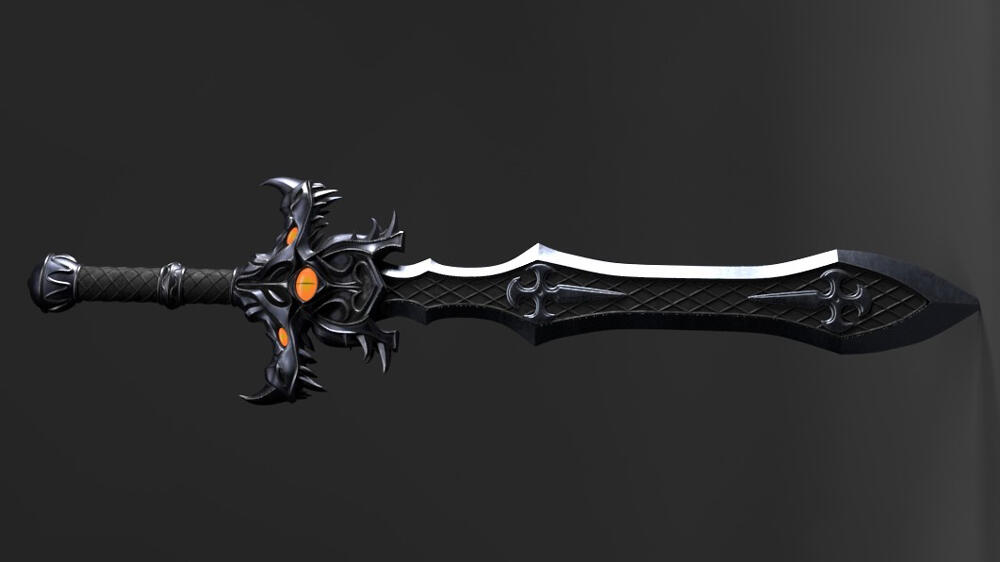
A 3D model I created during my studies at University
Getting back into it
Having done 3D modeling before put me a step ahead in the Advanced Diploma, but I quickly found myself challenged to improve on my skills. I took every assignment as an opportunity to do something a bit more complicated and while this early work was nothing special, I did find myself improving.Texturing was where I started falling behind, I had never done digital painting or anything like that before and my workflow ended up becoming more logical rather than creative. Learning to manipulate tools to get desired results and what values to use to emulate specific materials.
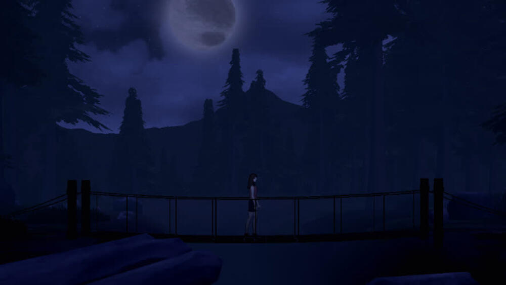
A cinematic moment from IOTA, a game I created with other students in my Advanced Diploma
Then came programming
One of the major projects in the Advanced Diploma was to create a game and attempt to get it into the Indie Games Room at AVCon. To do this we were advised to use Unreal Engine 4, and this was when I started learning Blueprint Scripting. We were a bunch of artists trying to make games and while a lot of teams opted to use the preset first person project I wanted to make a platformer.Over the course of the project I was making assets and trying to teach myself blueprint scripting and implement features all at the same time. Sure enough, with the help of my team we got it working in time for AVCon.
Back to university
Using my Advanced Diploma I got several courses ticked off for recognized prior learning towards the Bachelor of Creative Arts at Flinders University. Due to this, in my first semester I was doing my 3rd year major project topic. First lesson a team got up and asked if anyone knew blueprint scripting and could help them with a project. No one really put up their hand and not knowing what to work on otherwise I put up my hand. This started a trend and through out University I found myself being the blueprint scripter on projects.After having that initial project I worked on displayed in the Indie Games Room, I was approached by the rest of the Melonhead team to help them finish off our last assignments and planning what to do when we finished University.
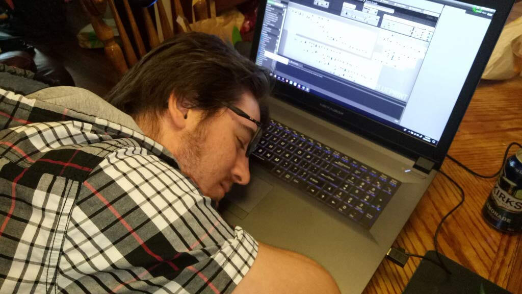
Feeling tired working on some blueprint script before a major University project submission
The global game jam 2018
The point I dedicated myself to programming was the Global Game Jam in 2018. Which some of you may be aware was what spawned the initial build of Rooftop Renegade. Since then I have been working hard to improve my skills as a programmer and utilizing them in refining the game to what it is now.George Martin
Boost, Warp & Launch, powering up a Renegade
Patrick Webb - Monday 01 July 2019
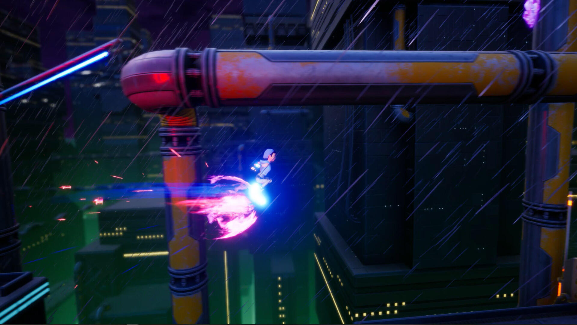
Boost is one of the abilities Svet can activate with the help of crystal shards.
Using the power of the Chrono Kicks, players can pick which abilities to use to help their current situation. Fallen through a pipe? Launch will get you back up. Van about to catch up? Boost out of there! And of course, warping through hazards negates their effects entirely!
This wasn’t always the case when the first renegade Svetlana, nicknamed Svet, was created. She could barely even jump without slamming straight into a pipe and losing all momentum. As well as a slew of assistive mechanics running behind the scenes, Svet’s abilities grew and changed over our first year of development.
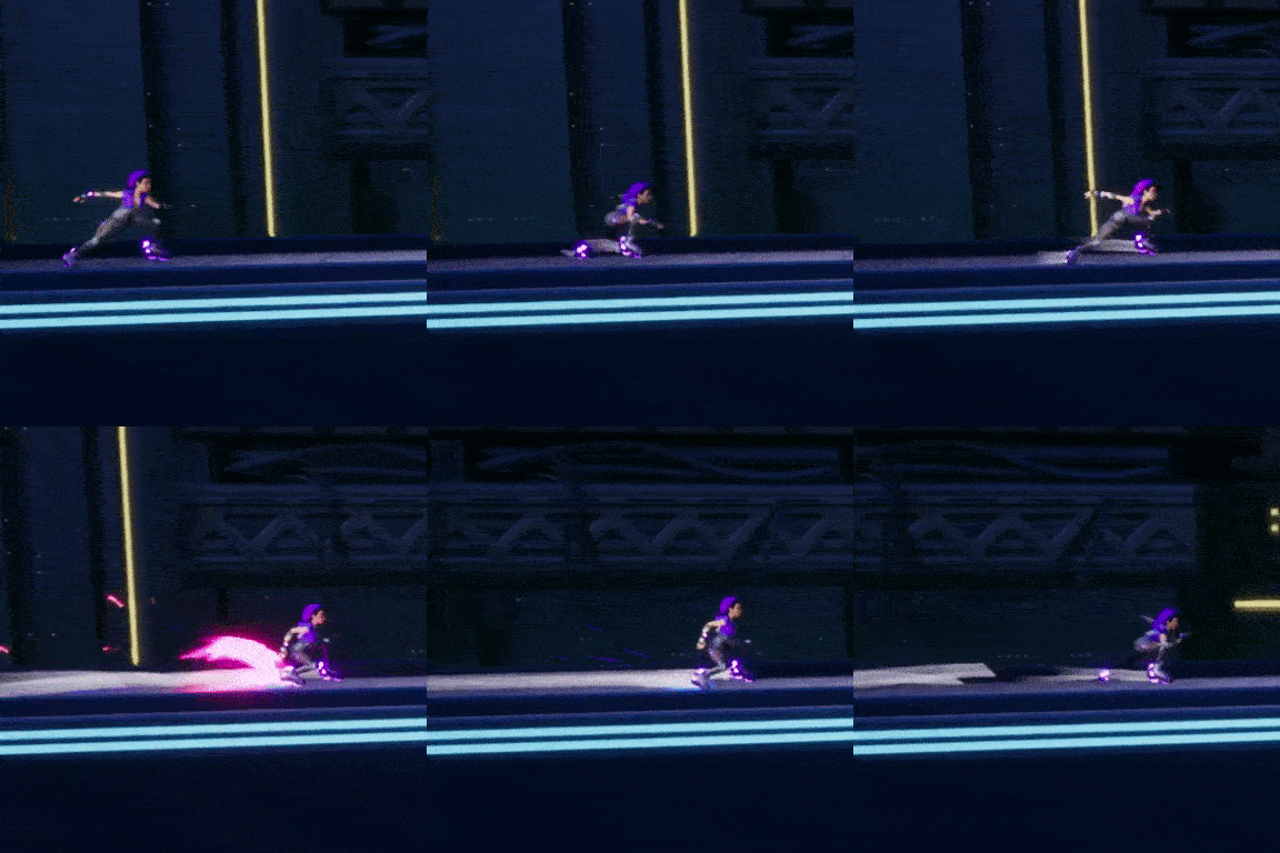
Boost, simple yet versatile.
The boost
The Boost ability was the first to be brought in. Simple enough, it allowed renegades to gain a quick burst of speed instantly when a boost tank was acquired. Quickly this was adapted to allow boost tanks to be stored and then used when the player felt the time was right. The next addition was an energy meter that filled over time so boost could be used even if there were no tanks around. This gave players a good amount of speed to get through a level even if they missed a lot of tanks.
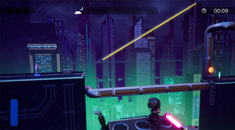
Just a dim little boost bar at the bottom left.
Temporal shift
After AVCon 2018, I started to realise that the renegade move set was a bit limited and only worked for specific playstyles. I wanted to encourage players to find different ways to get through the levels. Over the next few months of design testing, this came in the form of the temporal shards. These shards could be collected through the level; filling up a second meter that would activate a new ability, Temporal Shift. The Temporal Shift allowed renegades to warp through hazards, avoiding their effects completely. Now the player could not only move quickly through a level, but occasionally completely avoid situations that would have caused them to fail a level.
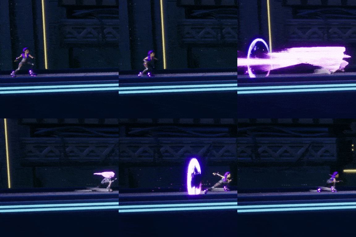
Temporal Powers tend to be flashy!
Overwhelming the player
While the new ability was working as intended, it was being underutilised. After a long period of testing I concluded the two meters created confusion and unnecessarily complicated management. Players would often try to boost when the shift meter was full or vice versa. Sometimes the shift would be completely forgotten. Not only this, but the various types of collectables & meters were creating too many things to manage while trying to focus on making a fast run.
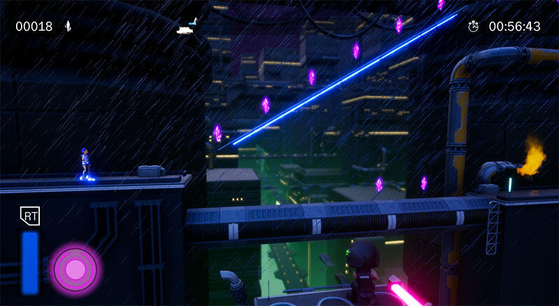
A lot to keep track of with Soldiers hunting you down!
During an overhaul of the levels, the boost tanks were removed from gameplay. I used this opportunity to test a theory. I completely removed one of the meters and had both abilities using the same energy source. Suddenly players have much less to keep track of in a level, knowing that shards would fill the meter and that would let them use powers. My intent was to create a dynamic where the player would have to decide what power to use in what situation, adding light strategic elements to gameplay. This new system worked great at our next playtest.
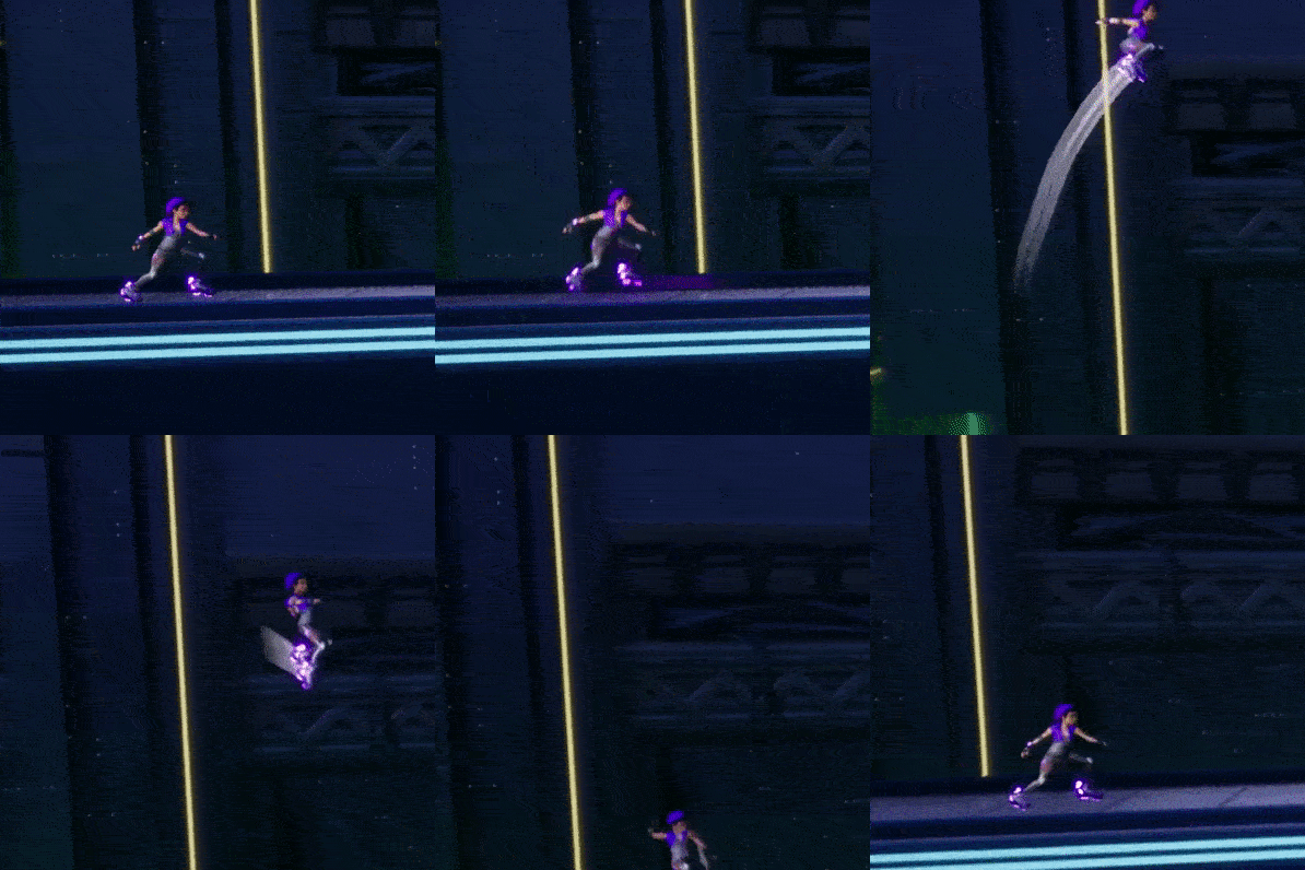
Need a lift?
Moving up
Now that the player had a streamlined system for activating abilities, I prototyped some new powers. This eventually led to Launch, a new power that throws the renegade up into the air, like a jump pad. Situations like falling through destroyed platforms, getting that extra height to reach a rail, or seeing that one collectable that was just too far up, were made much more achievable. The player now had complete freedom when deciding how to use their temporal energy.
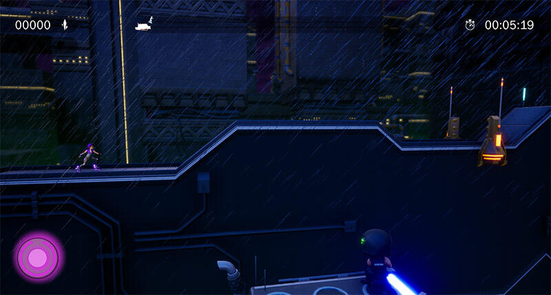
Nice and streamlined, look forward to seeing the UI art overhaul soon!
Balancing powers
Adding and changing a character’s core abilities can be a very challenging and iterative process, minor changes that feel like they shouldn’t cause issues can sometimes break the flow of a game entirely. It can be a long process to achieve, but when a new ability feels natural, like it’s always been there, the payoff is really satisfying.It’s an understatement to say our first Renegade has changed over the last year. From not having any special abilities, to having far too much to keep track of, to finally having streamlined strategic variety; players are now free to work out their preferred playstyle. I can’t wait to see what combinations are used next to beat our high scores!Patrick Webb
Svet's got a brand new bag! (no seriously)
Sam Frost - Monday 27 May 2019
Updating our favourite hover-bladed protagonist, Svet, has been a huge part of my work when I put on the character artist hat here at melonhead games.
For a little bit of history; the first design sketch was done in about 10 minutes after brainstorming the design and ideals of our main character at the Global Game Jam, back in 2018. Coming up with the key features was the quickest way to get my ideas down.
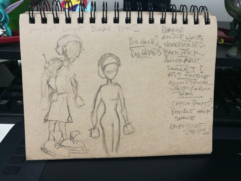
The original sketch from that fateful 48-hour feature frenzy.
We ended up with this; a rough, albeit fairly solid (if I do say so myself) design of our main character.
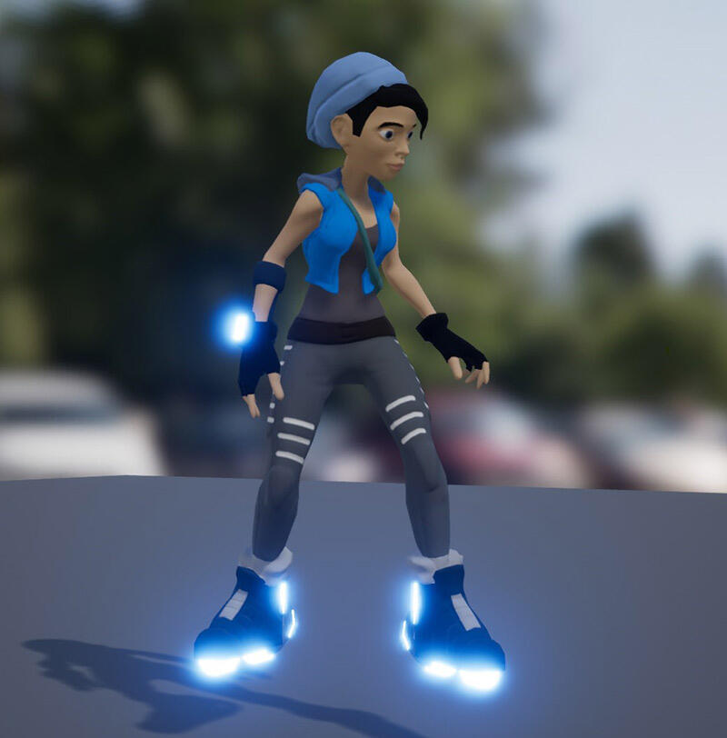
Ye olde game jam Svet.
Seeing as this entire project evolved from the global game jam, there was always going to be an update to clean up what was hastily crammed in on a weekend in February 2018; from the environments to the character. Which brings us to the first pass I did; textures.This was all about the time constraints; at the game jam, we opted to use flat colours and then run a post processed cel shader over it; as that was a simple and effective way of getting a stylistic result that would also save a bunch of time. It was the first thing on my list of reworks. If I remember correctly, I did also take the opportunity to resolve the more egregious topological errors, but the major changes were all just in the texture pass.The boots got a quick redesign and I busted out my old friend substance painter and the result was a Svet with much more definition of materials and generally just a bit more life through the shading, instead of just the flat colours previously applied.
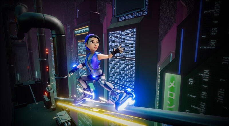
A nice little render I set up to show off the new textures after this update.
Moving on to now in what will be the last major overhaul, this has been a pretty big rework to solve some fundamental issues I never addressed after the game jam.Primarily the wireframe and rigging set up as well as some proportion issues which have been bugging me for a while. So, I’ve taken the opportunity to squeeze as much personality and thought into Svet and her accessories. I did a quick paint-over of an old render to see what kind of direction I wanted to take the design in, and taking a step back to actually think about how the character is being portrayed, and what I can do to imbue a sense of story through her design has been super useful. I tend to jump the gun and dive into 3D a little early as that is my strength, but planning these things out is really important.
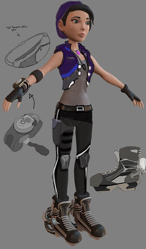
Rough outfit design, boot rework v2, the brand-new bag, and a fancy new temporal manipulator.
Moving into 3D, the final sculpt has ended up looking like this; taking the cues I planned out in the sketch I set to modelling and refining all the details to line up with the concept. Most of my time here was spent on her face as that was one of the major things I wanted to get right; however, retaining the same feel and personality while restructuring all the proportions was an interesting hurdle to jump.
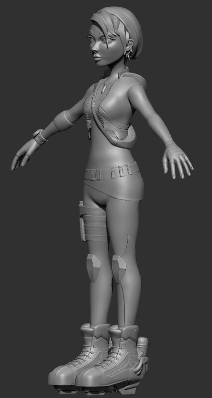
Sculpt of our reworked Svet.
Reimagining the character without losing her original design and personality has been a challenge overall, but I am happy with what I have learned and where this has evolved to in the end. I got to level up my skills, as well as push the design and character to the next level, and for our Renegade; the extra care and attention to detail is well deserved.
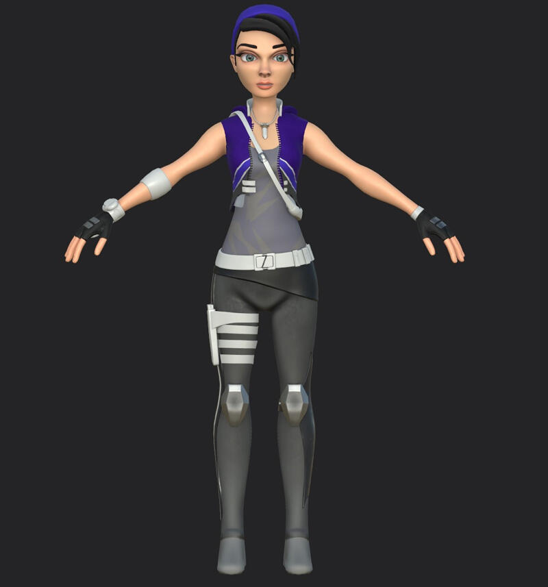
Our protagonist is almost ready to go!
Soon with Pat jumping in with the newly rigged and textured model we will have some slick new animations and a constant stream of new action shot screensavers and backgrounds for our computers and phones!Frosty
Subheading
Cyber City: Environment art from Game Jam to feature complete
Alex Ferrabetta - Monday 20 May 2019
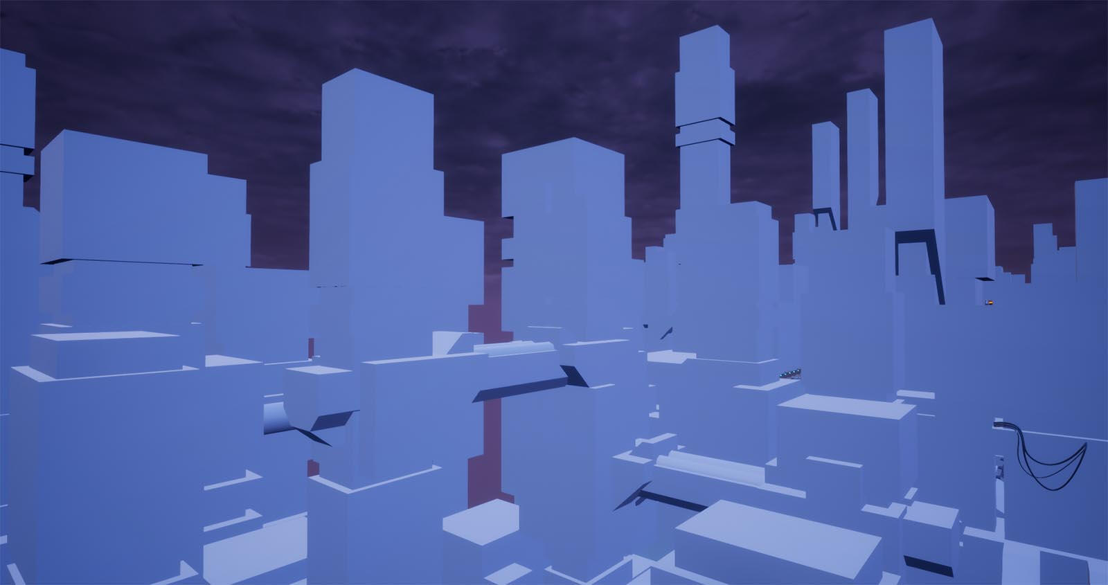
Grey boxes can be placed quickly in engine and help the artist get a sense of scale and shape language for the world they’re creating.
48 hours is a lot of time. You can start and finish a major university assignment, watch the complete season 5 of ‘the Simpsons’ 6 times in a row and save most of Termina before a cantankerous Skull Kid crushes the world with a maniacal-looking moon. It turns out you can make a pretty fun game in that time, too. Albeit with an unrealised environment, but the foundation can be accomplished in 48 hours – just don’t sleep.
Ok, that last part is bad advice: Always sleep! Sleep is more important than whatever you’re working on, even if it happens to be your team’s submission for the 2018 Global Game Jam. This was the first time the team had worked under such pressure. Sure, we’d crunched on our university assignments and spent hours at a time grinding in raids in Destiny 2 but we’d never built a game together in 48 hours. I was used to having an entire semester to work on my environments.
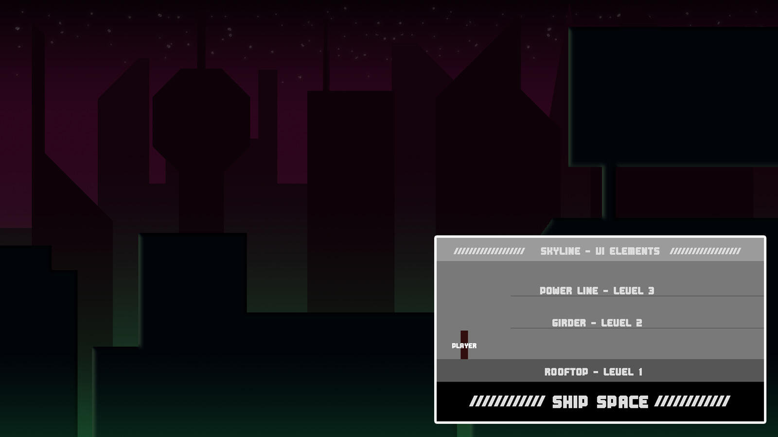
My ‘concept art’ of Cyber City from the 48-hour ‘Global Game Jam’. “Capiche, fellas?”
2018 Global Game Jam
For creating the environment and assets for what would become ‘Rooftop Renegade’ the first step was creating the modular platforms pieces for our Renegade to move along. Pat would be placing all the foreground assets (platforms, hazards, grind rails) himself so there had to be as little confusion as possible between the two developers. We worked with a strict UE4 unit measurement, so all Pat had to do was turn on snapping and move the pieces along the track.Texturing was kept to a minimum, there just wasn’t enough time to model, UV and texture – not with my limited skillset and Maya’s then-limited UV toolset. With the aid of a plugin, we adapted a cell-shaded look which means the 3D assets could just have a plain material applied and wouldn’t look out of place. As the background buildings wouldn’t be UV’d windows were decals projected onto the side of the buildings. Decals were also used to emulate the green ‘fog’ in the lower part of the city (as of this article, that decal is still in the current city along with added exponential height fog.)
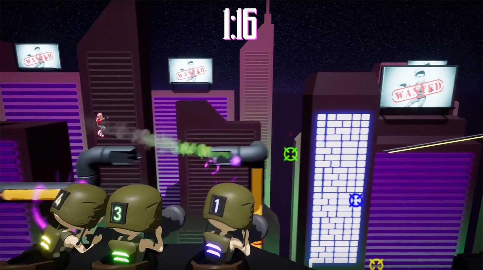
Cyber City after the 48-hour ‘Global Game Jam’.
AVCon 2018 Build
With the Game Jam over, we felt like we had a viable product; time to build on it! Our first pass we thought the game worked best as a mobile game. Unaware of phone capabilities, I began creating the next map (A carnival level) with a hand-painted workflow.Ah, agile development! It became obvious to us over the next month that a mobile version of Rooftop Renegade would be too restricting on features and that the platforms that would fit our gameplay best would be console and PC.I continued hand-painting textures up until a few months before AVCon 2018. Then one day whilst during the usual tinkering, Pat and Frosty retextured some buildings with a PBR (physically based rendering) workflow – a technique where light interacts with textures the same as they would in real life. Many games use this workflow, why it hadn’t occurred to me to do this I don’t know (most of 2018 is a blur for me, what with finishing university, work and starting a game studio) – but they rightly deserve the credit for making this change. Suddenly the game was pleasing to look at, both as a player and a developer.
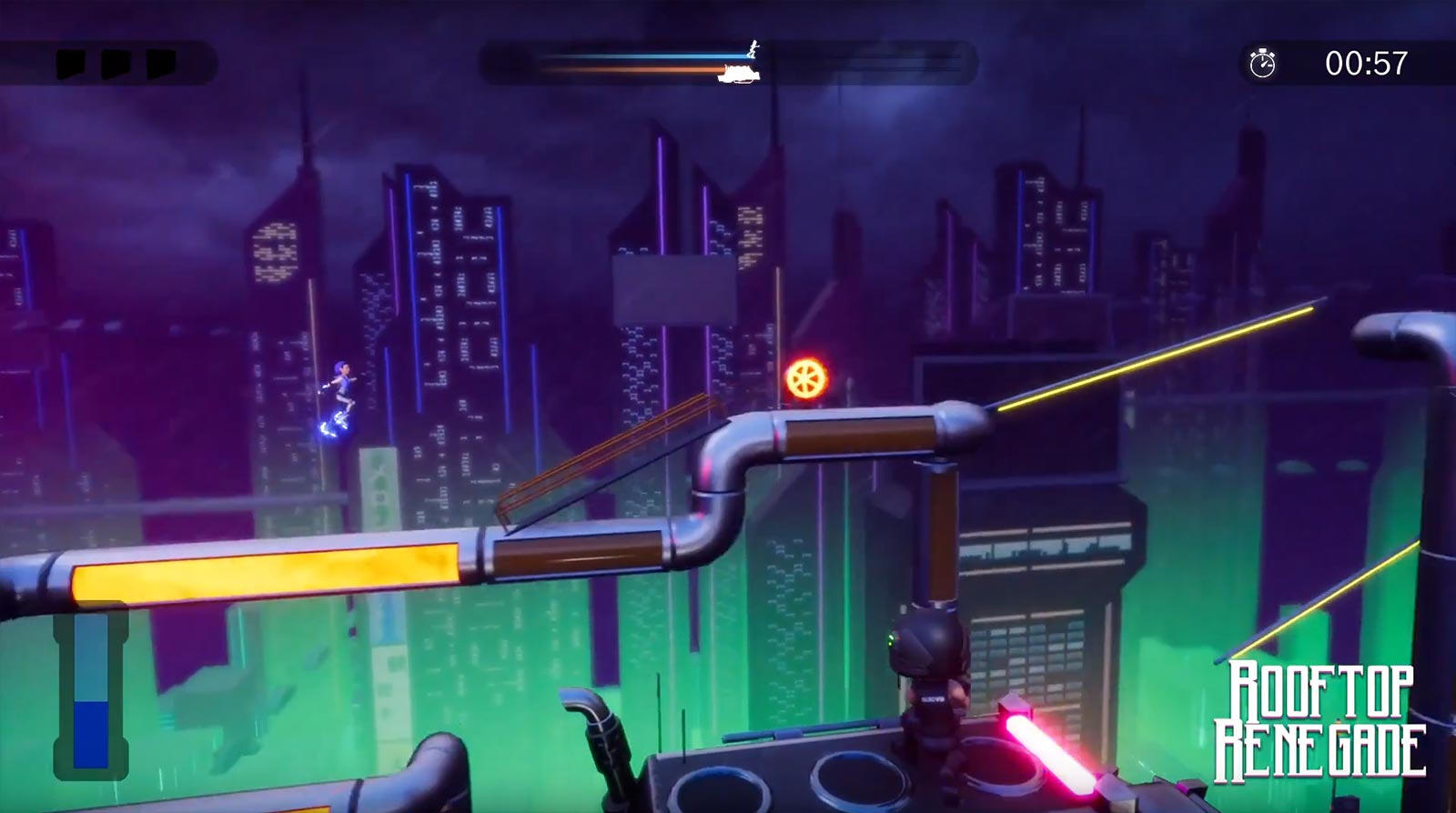
Cyber City as it appears in-game at AVCon 2018. Whilst bright and engaging, I wanted a more ‘sprawling metropolis’ feel that contrasted against Svet.
Present and future
The AVCon 2018 Cyber City is not what I envisioned for the final product, but I’m still proud of it. I imagined a giant sprawling metropolis where Svet was just a spec in this world. Where detail is limited by camera field of view – not because of time and team constraints.One issue that existed with the AVCon Cyber City was that the background was too bright and too eye catching. Whilst this does not seem like an issue, especially in screenshots, we’re trying to design a game where the players are moving fast and focusing on precise movement – anything too distracting must be toned down to ensure consistent gameplay.Other issues I felt with the environment was the buildings looked separate from the foreground due to their design and colours. Repeating patterns were evident in the buildings’ windows, all the skyscrapers faced one direction and stretched straight up with no stagger in their silhouette. These are all issues I had to consider when designing the final iteration of Cyber City.This final redesign of Cyber City began as every map should have; an in-engine greybox with stacks of giant cubes emphasising the scale of the complex city. By utilising basic shapes in engine, I was able to dictate the shape language for the city and create unique building designs on the fly. Once I had a good idea of scale and shape, I got to work on the texture.Cyber City is a single 2048x2048 texture. All the building variants have been UV’d and textured on what is known as a ‘trim sheet’. The usual texturing process involves building a model, laying out the UVs and texturing accordingly. The trim sheet method involves creating a texture ‘sheet’ first and applying the necessary uvs to the corresponding ‘trims’. This is great technique for something like a building because I can decide on the fly whether I want a section to be, say, girder or window.
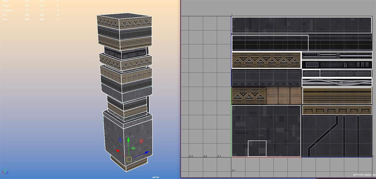
One of the many buildings in Cyber City laid out on a ‘trim sheet’(right). This technique allows for many unique texture layouts.
My approach to environment art has changed a few times over the course of this project. As a team, we’ve learned so much on streamlining our world building which will be covered in later blogs. From following a simple photoshop design to experimenting with colour palates and world scale in engine, I feel confident that in the next environment the sky is the limit…
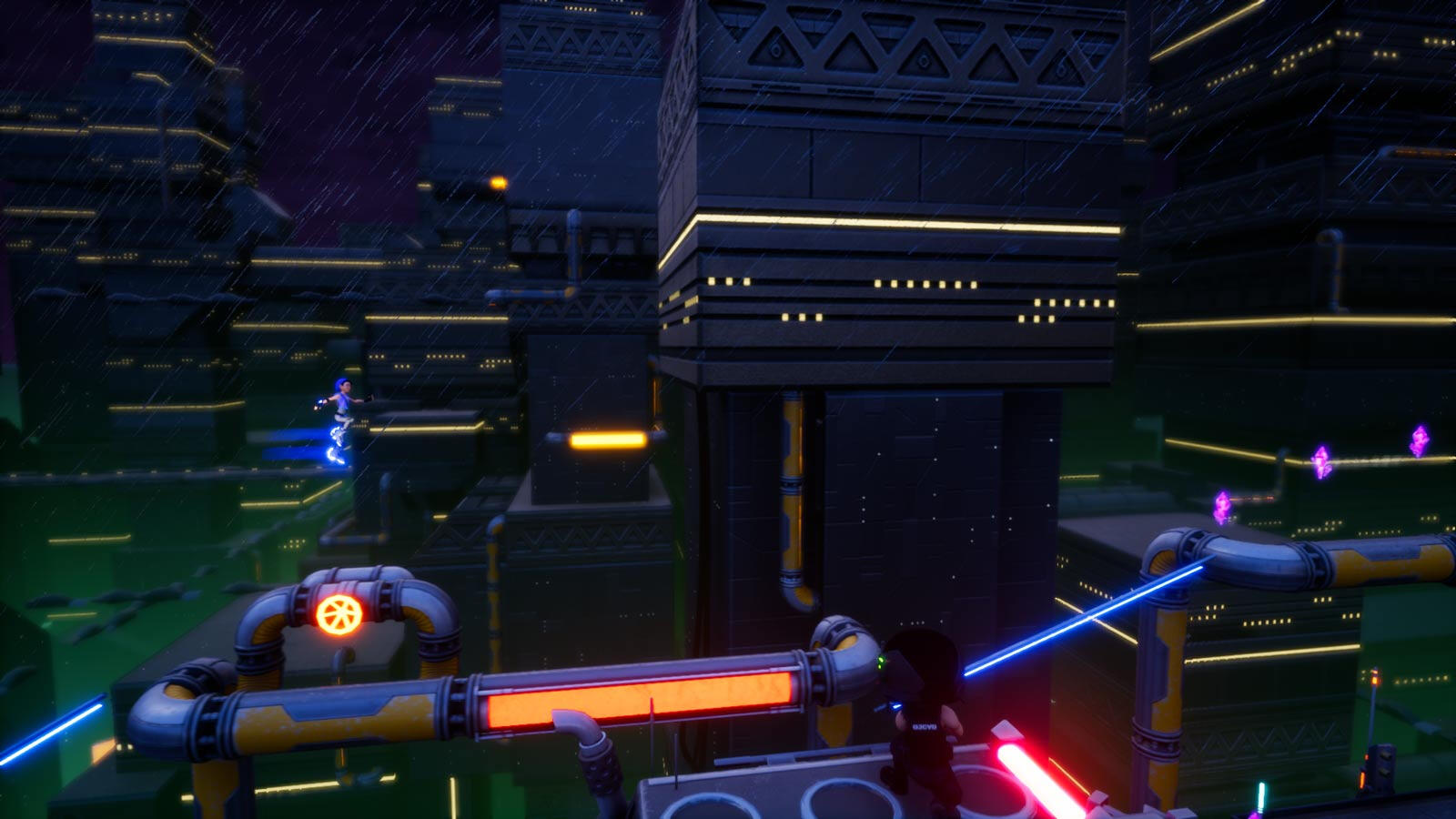
Cyber City in its current form. Its darker palete allows for players to focus on the gameplay action and to imagine what else could exist in this over-crowded urban jungle.
Alex Ferrabetta
Artificial Intelligence (AI) in Rooftop Renegade
George Martin - Monday 13 May 2019
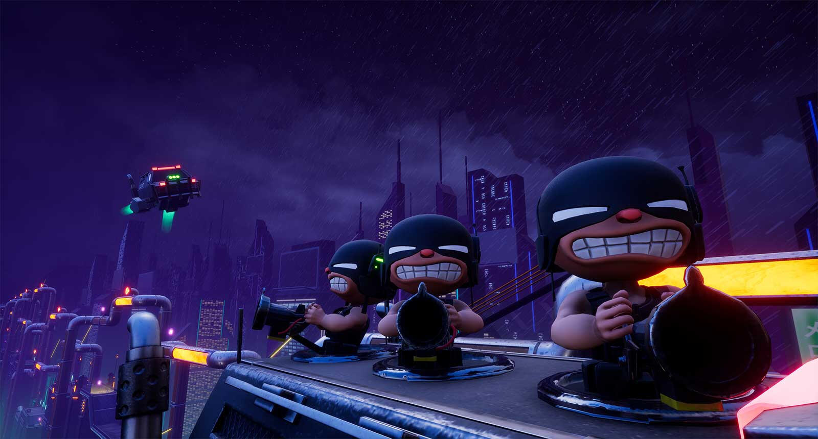
A group of Grunts ready to give chase!
Hello there! Melonhead’s friendly neighbourhood programmer here, ready to share a tale about the creation of our gunner’s AI (Artificial Intelligence). When I first started on this project AI wasn’t even in my mind. When we got our first build together at the 2018 Adelaide Global Game Jam it was exclusively a multiplayer experience. A party mode with gunners being controlled by other players and that was that. However, as we kept working on the project it became difficult to have someone else in the team playing as a gunner to check how playing the runner felt and without the hazards being destroyed it didn’t convey the same feel.
The origins of single player
In order to simulate having other players in the game while testing, our designer Patrick introduced a trigger box that sat around each hazard. This box when touched by the player would cause the hazard to generate a random value, with the result telling the hazard how to respond; either do nothing or self-combust in a dramatic fashion, as if it had been shot by a player. The more we tested the game ourselves in this developer exclusive single-player mode, we thought to ourselves “what’s stopping the game from having a single-player mode?” Player’s enjoyed just being a runner, why not let them? However, the hazards alone destroying themselves didn’t feel the same as having a player to blame for the untimely destruction of a hazard. This was when we created Jean; a character that, at the time, would only exist in single player. He would shoot at the hazards and receive many a curse for it even amongst the melonheads.
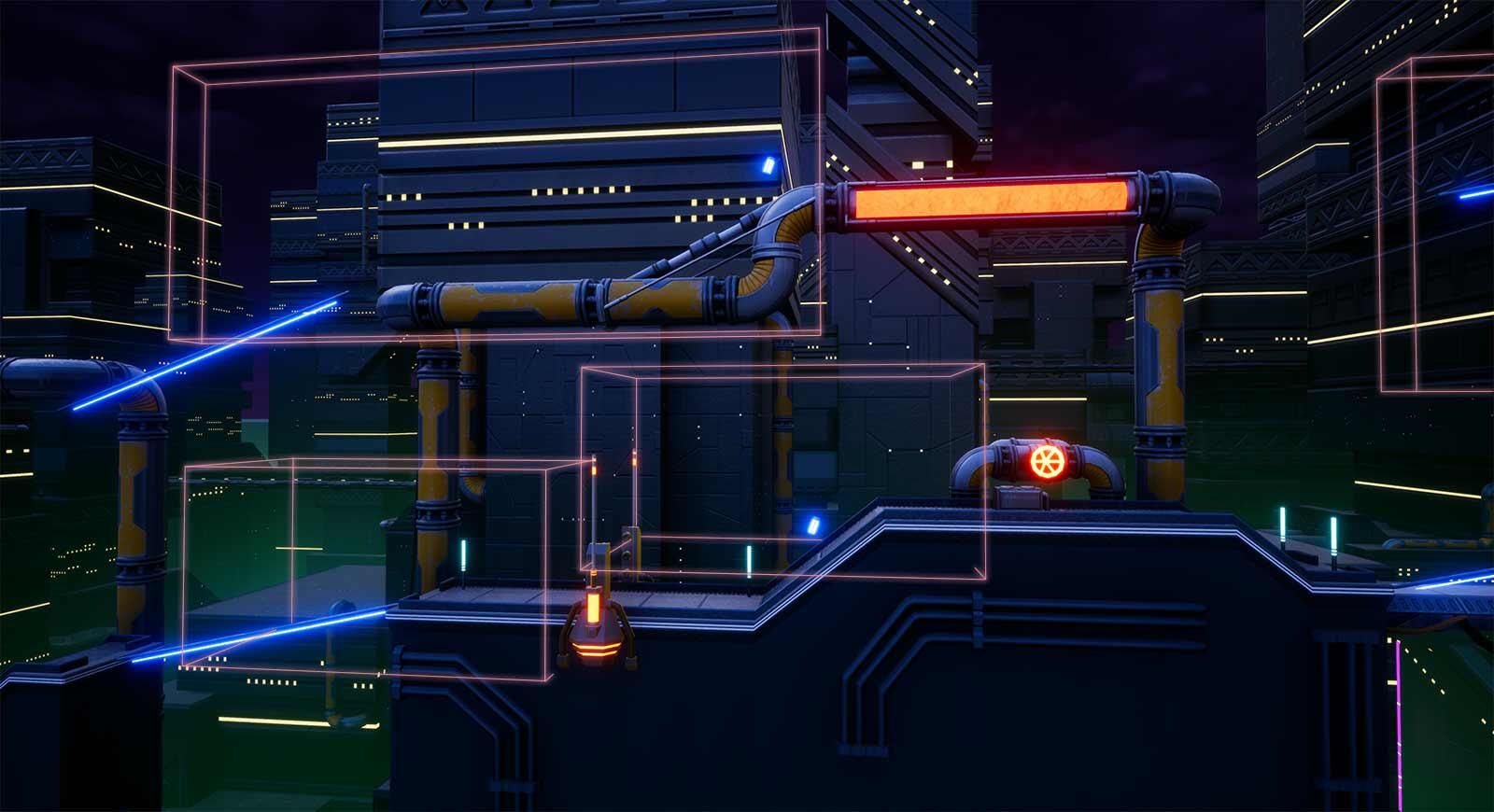
Visual representation of trigger volumes (in pink) placed behind each hazard.
HOW I CHEATED AI
I had never created AI before, and when we debuted the single-player mode at AVCon, Jean was entirely for show. While to those playing the game, it looked like our antagonist was shooting hazards in their path and destroying them, behind the scenes it worked very differently. All that changed between our developer mode and this single-player experience was before the hazards self-detonated they would tell Jean to aim and shoot a harmless beam towards them before detonating themselves as they always had. Jean was only following orders from the hazards in the level and received all the blame.
A NEW PROBLEM
After AVCon wrapped up, we decided that a full single-player experience was a great idea and we began discussing other characters we could introduce as well as combinations to go up against. I then realised that my cheated way wouldn’t work. If it was for any character other than our sniper, they would potentially need more than one shot to destroy the hazards. The way it was set up also limited us to a single gunner when in single player. Both things needed to change so I delved back into the character and decided the best solution was to give the gunner a brain of its own.
The Solution
I remade the whole system from scratch. I kept the trigger boxes around the hazards but gave them a new purpose. They now told the gunner when the player was close to the hazard and the gunners could make the choice of shooting it for themselves. This means the hazards no longer destroyed themselves and the gunner would now shoot projectiles the same way they would if controlled by a player.This new system can now scale with any number of characters we make for party mode inheriting their traits like damage and fire rate. The new system can also set the number of gunners in a level, and which character they each are. As a runner approaches a hazard each gunner individually takes note and decides if they will shoot it based on predetermined chance or wait for another opportunity. To give a bit more warning before a hazard is destroyed, we added a crosshair that shrinks onto the target before the gunner starts shooting.
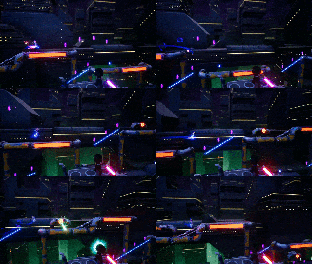
Svet entering the trigger volume and the AI destroying the respective hazard.
These changes to the gunner have gone somewhat under the radar but were first debuted at the recent playtest at greenlight comics. It may not have looked much different from what we had at AVCon but know the gunner is a lot smarter now. Keep an eye out for them in future levels, they’ll be back and in greater numbers.Signing off,
George Martin
Greenlight Comics Playtest Retrospective - March 2019
Patrick Webb - Monday 6 May 2019

Comics and video games, a great pairing!
There’s a common problem that video game developers suffer… after staring at the same game for a year, it’s really easy to lose sight of what does and doesn’t work about it. I can’t tell you the amount of times Frosty has told me a level is too easy, only to then try it on a newcomer and have them be utterly defeated by it!
It had been 6 months since anyone outside of the office had played rooftop renegade, and there had been a ton of new changes and mechanics added in since then. We needed fresh players to try out what had been added, and make sure we’d taken the game in a direction fans could agree with!
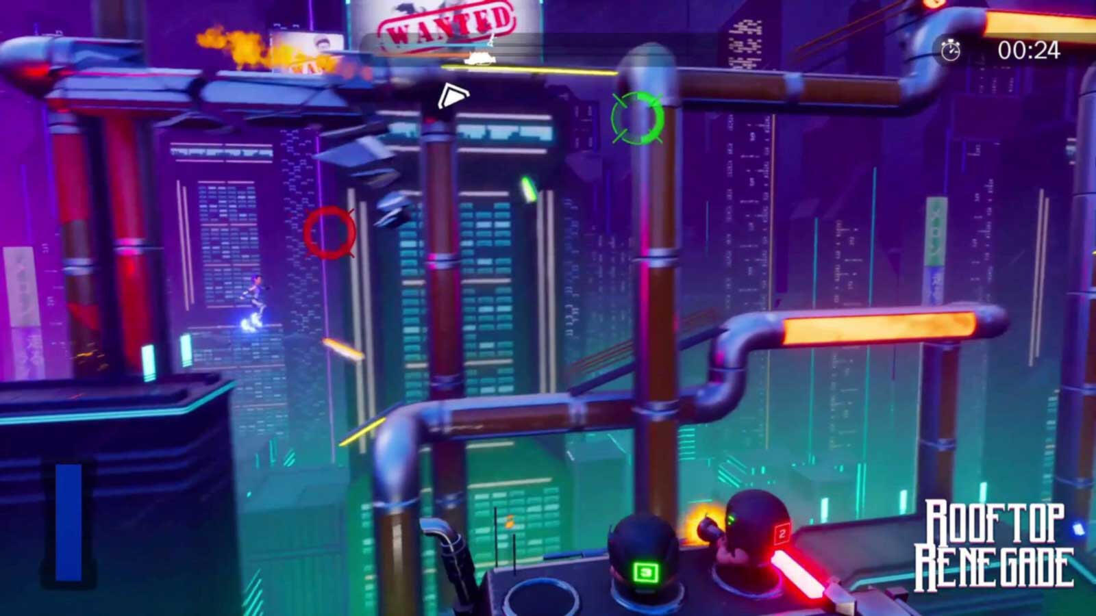
AVCon July 2018, a lifetime ago…
Our team is really passionate about our industry, and always looking for ways to get more people interested in game development. We saw an opportunity to catch up with, and meet, not just our friends but also fans of games and development in general, all while getting some valuable feedback. Instead of inviting some friends around to play our game, we decided to make a public event, where anyone could walk in, play the game, and learn a bit about how we put it together. So we booked a venue, set up an invite, and started building up a guest list, easy right?Well here’s where agile development gets a little messy. During the build up to the event we brought people from around our office at GamePlus to test out the game, hoping to iron out any major bugs before the big event. Here we ran into two main issues. The levels were too hard, and a lot of the new mechanics were unclear. Another result of us working on the game too long, we needed to drop what we were doing make some new additions, and fast!
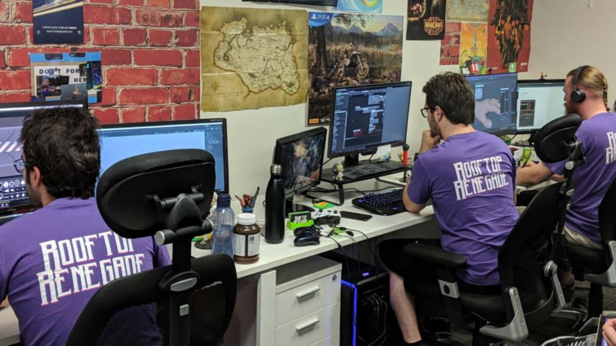
The team hard at work, unaware of all the new tasks that are about to come rushing in!
As the game’s designer, it’s my job to work out solutions to these kinds of problems, prototype them, and then pass them off to be implemented by either artists or programmers. The unfortunate reality of this job is that often I have to add to my own and the team’s already large workload. I remember less than a week before the event, tapping Alex on the shoulder, him already bracing for the bad news, “Hey Alex… we don’t have a score screen layout yet”.We managed to pull off a very strong week of fixes and additions in the lead up to the event. Using my new level building system I managed to build up a tutorial, and a much more friendly first level, which brought us to a total of four playable challenge levels at the event. Combined with Alex’s amazingly complex new version of the Cyber City environment, we had a great selection of playable content ready.We’ll be posting up blogs that go into the nitty gritty about these changes, so look out for those in the weeks to come!
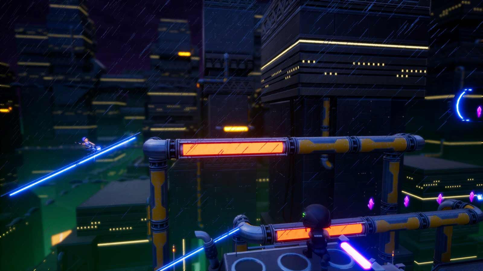
Cyber City looking wonderfully grim!
Finally, it was the Saturday morning of the event. We’d faced a lot of challenges along the way, and as is common with game development, we’d left too much work and bugfixes until crunch time. Exhausted, nervous and excited we packed up our equipment and rushed over to Greenlight Comics. The rest of the day is a blur for me, but some great photos, excellent feedback, and excitement from players, made the event absolutely worth the effort. I can’t wait for the next one, and I hope to see you all there!Much Love,
Patrick.
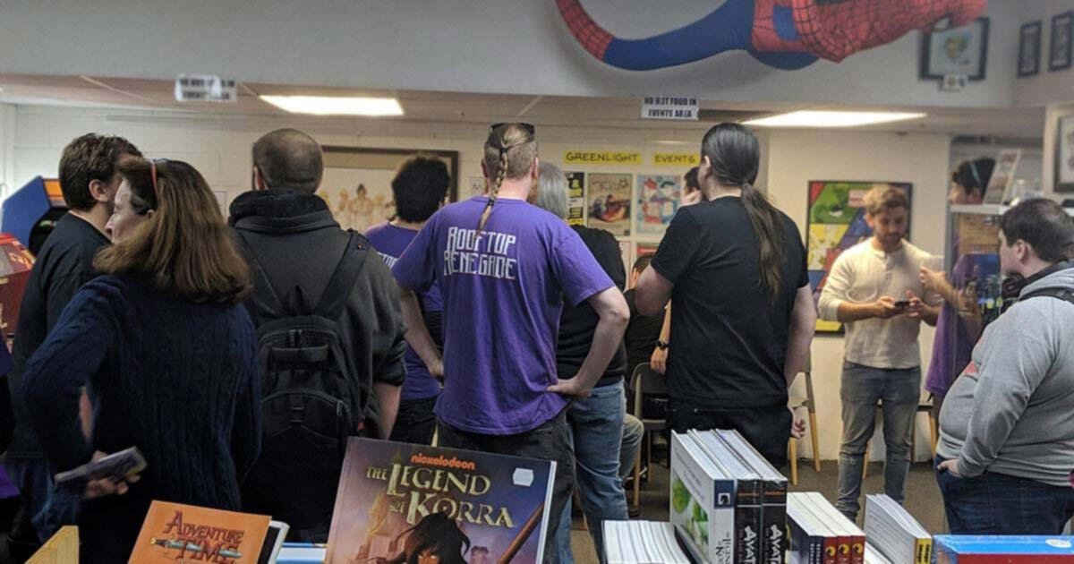
Everyone managed to get a turn to play, just!
Patrick Webb
Rooftop Renegade, The origin story
Rooftop Renegade Dev Team - 21 Feb 2019
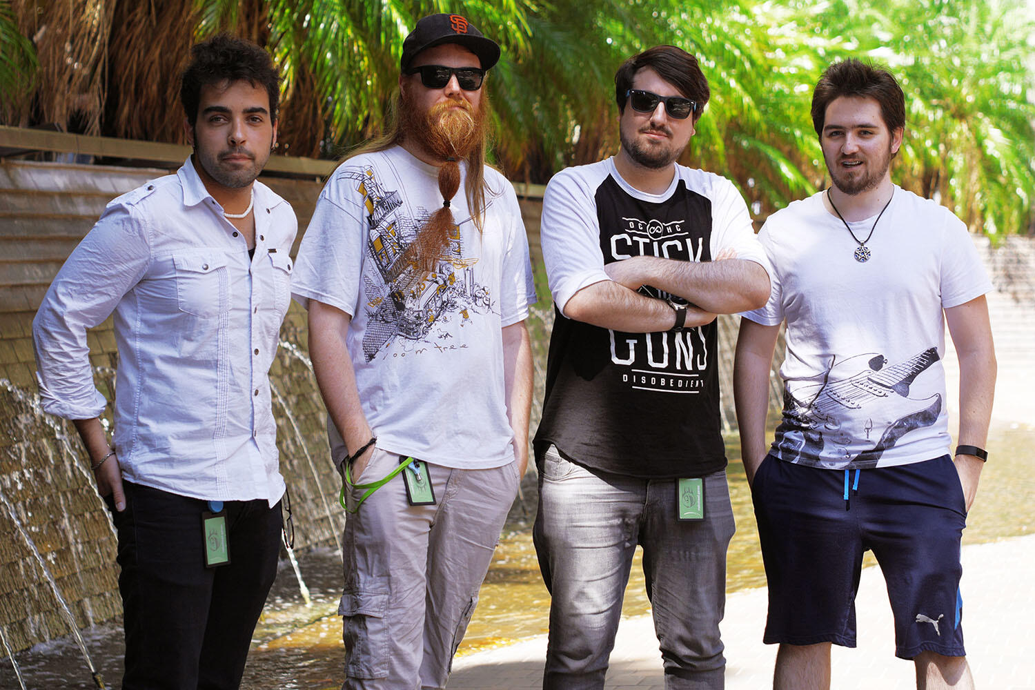
The Rooftop Team (L to R) Alex Ferrabetta, Samuel 'Frosty' Frost, Patrick Webb and George Martin.
It’s 2am in the dark of a parent’s loungeroom. AVCon 2016 opens in 6 hours, and a barely working game is compiling for deployment. Pat leans over the dark table, lit only by dim monitors, “Hey Frosty, let’s do this again but with a full game, we’ll be prepared now”. Sam takes a minute to process in his half-asleep state, “Yep, let’s find a team”.
Melonhead Games began with a simple drive. We love working on games and we love unique experiences, so let’s make some! Pat and Frosty started pitching to other student developers at their course, soon enough we were a team of four. First joined Alex, a great artist with a keen eye for style and detail, then George, who's technical mind has pushed our blueprints much further than we could have hoped to achieve on our own.After working on some smaller projects together we entered the 2018 Global Game Jam. A challenge to build a playable game prototype in 48 hours. By the end, while completely exhausted, we had our first build of Rooftop Renegade. A party game with one player running through a level while others shoot the track ahead of the runner to stop them.
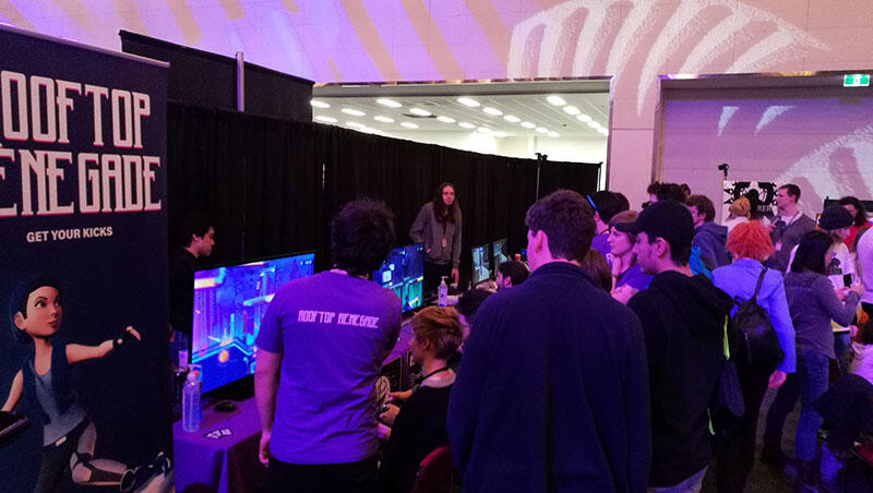
Melonhead Games presenting Rooftop Renegade at AVCon 2018.
We managed to grab a great office at GamePlus Adelaide, and over the next few months experimented with various directions to take the idea. This included a mobile endless runner, and an online multiplayer experience. Quite by accident we found a single player challenge mode was just as exciting as the multiplayer (Pat needed a way to test without distracting the rest of the team). Rooftop Renegade pivoted to a challenge-based platformer, with the party mode still included for local fun.
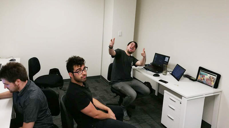
George, Alex and Pat showing all the emotions involved in moving into an office.
We managed to get both singleplayer and multiplayer builds ready for AVCon. This was the first time anyone had seen it since it was a Game Jam prototype and we were incredibly excited to get people playing. The reception was amazing, the enthusiasm from players was exactly what we needed to keep motivated after a huge semester. Not everything was perfect though, we somehow managed to end up in the wrong carpark after a rushed pack up. Pat and Frosty waited impatiently for Alex to come rescue them and get them home. Thankfully, he came through!
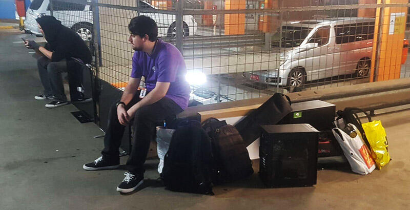
Frosty and Patrick about to crash after the AVCon weekend.
Since then we’ve taken Melonhead Games through NEIS, a government program to help small businesses get started. We’ve established a company and have been chipping away at the backend of Rooftop Renegade, making sure the gameplay is as tight and fun as possible.

Keep a lookout in the near future for our Rooftop Renegade banners at events!
We're plugging away at a build for our next playtest event and can't wait to show you all how far the game has come! Get your kicks!Much Love,
Rooftop Renegade Dev Team

